| Author | Thread |
|
|
09/23/2002 04:56:00 PM |
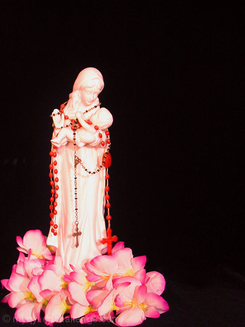
| I think the beam of light would not only help the subject but also give more depth/roundness to the statuette. Otherwise good positioning. |
|
 Photographer found comment helpful. Photographer found comment helpful. |
|
|
09/23/2002 03:36:00 PM |
Thanks all! Those that pointed to the red rosary clashing with the flowers were dead on right... I never noticed and this has sat in my house for 5 years now :)
What I was aiming for with this was the whole "light in the darkness" thing and Jesus being referred to (by Christians) as the "Light of the World"... Thus the darkness = negative space that will be "filled"... Yeah, I know, it didn't quite get there... I considered two possible reshoots....
1 ~ A bright spot light beam coming from the upper right hand side, or...
2 ~ A small cross in the upper right...
Not sure if they would have helped |
|
Comments Made During the Challenge  |
|
|
09/22/2002 02:58:00 PM |
| I would have like another background than black. |
|
|
|
09/21/2002 12:06:00 AM |
| I think the tension (aka attraction) in the eye contact would be a good example of negative space. |
|
| Photographer found comment helpful. |
|
|
09/20/2002 03:59:00 PM |
| I like the colors and composition on this. karmat |
|
|
|
09/20/2002 03:43:00 PM |
| Good contrasting background but the subject is a little over exposed. Good luck in the current challenge! Grayce aka Gracious |
|
| Photographer found comment helpful. |
|
|
09/19/2002 02:16:00 PM |
| I think this could be a better photo if not trying to force the negative space aspect. Colors are strong, but the red in the rosary and the red of the petals are not of the same hue, and that causes some uneasiness. I'll meet you halfway with a 5, because I think the photo is technically pretty good, and somewhat meets the challenge. |
|
| Photographer found comment helpful. |
|
|
09/19/2002 03:48:00 AM |
|
|
|
09/18/2002 07:02:00 PM |
| Great colors in this one. I like how you didn't cut out any of the flowers. 7 |
|
| Photographer found comment helpful. |
|
|
09/18/2002 01:24:00 AM |
Composition:7 Lighting: you have lost some detail due to harsh lighting 5,
Appeal: 7, Total Rating 6Sulamk
|
|
| Photographer found comment helpful. |
|
|
09/16/2002 08:05:00 PM |
| Very good use of negative space. I like the placement of the object too. If the red rosary had been left off, it would have been a better shot. It clashes with the flowers. |
|
| Photographer found comment helpful. |
|
|
09/16/2002 04:46:00 PM |
|
|
|
09/16/2002 03:50:00 PM |
| Creative idea, great color. Score 6 Justine |
|
|
|
09/16/2002 03:09:00 PM |
| well done--details and color--9bobgaither |
|
| Photographer found comment helpful. |
Home -
Challenges -
Community -
League -
Photos -
Cameras -
Lenses -
Learn -
Help -
Terms of Use -
Privacy -
Top ^
DPChallenge, and website content and design, Copyright © 2001-2025 Challenging Technologies, LLC.
All digital photo copyrights belong to the photographers and may not be used without permission.
Current Server Time: 03/13/2025 01:09:40 AM EDT.