| Author | Thread |
Comments Made During the Challenge  |
|
|
09/22/2002 10:23:00 PM |
| I haven't seen/used one of those in a while. |
|
|
|
09/22/2002 02:58:00 PM |
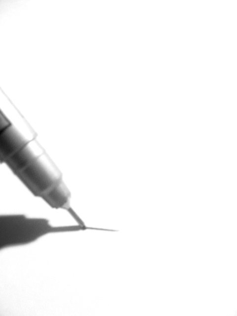
| Should have been sharp to really get more points. Good idea though. |
|
 Photographer found comment helpful. Photographer found comment helpful. |
|
|
09/21/2002 12:10:00 AM |
| Better focus and sharper contrast could improve the shot. Nice concept. 5 - MarkRob |
|
| Photographer found comment helpful. |
|
|
09/20/2002 03:28:00 PM |
| Nice idea and meets challenge, but the focus is soft. Good luck in the current challenge! Grayce aka Gracious |
|
| Photographer found comment helpful. |
|
|
09/20/2002 02:57:00 PM |
| This is a neat effect, and works well with the white background of dpc, but i think the pen needs to be a little sharper (just my personal taste). I think the pen sharply focused with high contrast would have a neat effect. karmat |
|
| Photographer found comment helpful. |
|
|
09/20/2002 01:02:00 PM |
| I give you a 10 for concept, a 7.5 for creating nice contrast (I would try to find a way to make your blacks blacker) and a 2 for focus. |
|
| Photographer found comment helpful. |
|
|
09/20/2002 12:24:00 PM |
| Apologies for not leaving a proper comment. Please email me if you'd really like one. I�ve voted this image a 6. Kavey |
|
|
|
09/20/2002 03:23:00 AM |
| This one doesn't appeal to me that much. It kinda is too washed out for my taste. 5 |
|
|
|
09/19/2002 04:49:00 PM |
| Great idea. Focus is the only problem I have with it, and I can't tell if you planned soft focus. 9 |
|
| Photographer found comment helpful. |
|
|
09/19/2002 04:42:00 PM |
| I really wish that pen was just a bit more in focus. |
|
|
|
09/19/2002 04:39:00 PM |
| a little bit of focus might have made it a prizewinner...but without it ... |
|
| Photographer found comment helpful. |
|
|
09/18/2002 08:03:00 AM |
| Nice idea but the focus on the pen lets it down. Nice contrast and light with a good concept. 7 - floyd |
|
| Photographer found comment helpful. |
|
|
09/18/2002 03:09:00 AM |
| too much light... out of focus |
|
|
|
09/18/2002 02:14:00 AM |
|
|
|
09/17/2002 01:57:00 PM |
| idea and compo are great but poor focus lets it down. if your macro capability isnt up to snuff try putting a magnifying glass in front of your lens. mag99 |
|
| Photographer found comment helpful. |
|
|
09/17/2002 02:50:00 AM |
| whew dead on for the assignment. great directional light |
|
|
|
09/17/2002 01:34:00 AM |
| Being a writer/ artist this hits me on a personal level. I love the feel of a fresh piece of paper and an excellent writing utensil (I can tell that is a Uniball fine point, right?). |
|
|
|
09/16/2002 10:26:00 PM |
| Cool shot. The shadow makes it! The pen appears to be a little blurred, which to me adds to the artsy-ness of the picture. |
|
| Photographer found comment helpful. |
|
|
09/16/2002 09:30:00 PM |
| Nice image, though a bit soft. If after a grainy appearance, you might try bumping up the ISO to 400 or higher (if your camera supports it) and use a neutral density filter to keep the exposure within the camera's capabilities. |
|
|
|
09/16/2002 08:07:00 PM |
| You met the challenge. I would have liked it better if the pen was in sharp focus but it works this way. |
|
| Photographer found comment helpful. |
|
|
09/16/2002 07:14:00 PM |
|
|
|
09/16/2002 02:03:00 PM |
| I understand that the lack of focus is probably a design element, but it doesn't work for me. Which is a shame because my instinct tells me I would have scored it an 8 had the focus been sharp. 6 Jak. |
|
| Photographer found comment helpful. |
|
|
09/16/2002 11:32:00 AM |
Great work I like the soft focus - and yet it still has a lot of detail. Yes, the Neg Space makes a difference and adds to the subject and the effect of the photo. The Neg Space REALLY draws your attention right to the pen. Technically great work. Great composition. The placement here is perfect - as not being all the way in the corner (although, As I look at this, I wonder, does the person writing with this pen hold it at the end of the pen? -just a thought I had) So, it's great, makes a person think. Great Work 10
Ruthann
(updated) |
|
| Photographer found comment helpful. |
|
|
09/16/2002 10:26:00 AM |
| Good creative idea. I don't think the 'blur' adds to this shot at all, would of liked to see that left off. Still it's right on target for the challenge. Nice job. Scroe 6 Justine |
|
| Photographer found comment helpful. |
|
|
09/16/2002 09:43:00 AM |
| i think the soft focus was used intentionally......... it certianly makes the image more interesting. |
|
|
|
09/16/2002 06:21:00 AM |
| This is really a great idea and the composition is also great... My mind is begging for stronger focus on this pen, but somehow the softness of it still is quite gripping in some strange way... good work :) = 8 - jmsetzler |
|
| Photographer found comment helpful. |
|
|
09/16/2002 05:57:00 AM |
|
|
|
09/16/2002 04:27:00 AM |
Composition:good but th image is out of focus 4
Lighting: good 5,
Appeal: 4, Total Rating 4 Sulamk
|
|
|
|
09/16/2002 03:47:00 AM |
| This is one of the best uses if neg. space I have seen here. The white background is appropriate (and hence makes the photo work well). Perhpaps the pen is a little too out of fcus for my liking, was the focus intentional? I like the shadow. Scores highly for use of neg. space, loses a little because of focus. Excellent work overall! |
|
| Photographer found comment helpful. |
|
|
09/16/2002 12:31:00 AM |
|
Home -
Challenges -
Community -
League -
Photos -
Cameras -
Lenses -
Learn -
Help -
Terms of Use -
Privacy -
Top ^
DPChallenge, and website content and design, Copyright © 2001-2025 Challenging Technologies, LLC.
All digital photo copyrights belong to the photographers and may not be used without permission.
Current Server Time: 03/12/2025 04:55:56 PM EDT.