| Author | Thread |
Comments Made During the Challenge  |
|
|
02/24/2004 05:44:08 PM |
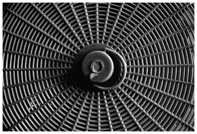
| The repeating patterns and circular composition are interesting. I think that there is an awful lot of grey and the highlights suffer because of it. |
|
|
|
02/23/2004 10:25:32 AM |
| can't stare at that for too long! ) Nice repetition without being dull. |
|
|
|
02/20/2004 11:39:42 PM |
| Very nice. It's making my eyes crazy and I enjoy that kind of thing! |
|
|
|
02/20/2004 11:27:16 PM |
| this could have been a 'knockout' if you had placed that jub off to oneside (perhaps on a 3rd line). Also if a contrasting shape could have been introduced it would add to the composition. Still, nicely photographed. |
|
|
|
02/19/2004 11:20:35 PM |
| One of the best submissions. Nice job. |
|
|
|
02/19/2004 11:44:01 AM |
|
|
|
02/19/2004 10:37:52 AM |
| Intriguing pattern - and shows good understanding of the ideas behind regular and rhythmic compositions such as this - even allowing the handle to break that pattern is effective. Touch of brightness lower left is amazingly distracting for such a small area, thugh it's a function of the regularity of the patterning. Get some feeling of plastic from the image, but mutedly so. Nice work. |
|
|
|
02/18/2004 07:04:15 PM |
| You should have put the middle of the web on one of the thirds of the photo (rule of thirds). You should have tried to be a little more creative with your perspective, and composition, but the photo has potential. |
|
|
|
02/18/2004 10:12:39 AM |
| I see the texture. Composition is good for the subject. Just no real interest here in the subject. Lighting is okay, but maybe more contrast would add interest. |
|
Home -
Challenges -
Community -
League -
Photos -
Cameras -
Lenses -
Learn -
Help -
Terms of Use -
Privacy -
Top ^
DPChallenge, and website content and design, Copyright © 2001-2025 Challenging Technologies, LLC.
All digital photo copyrights belong to the photographers and may not be used without permission.
Current Server Time: 03/12/2025 03:19:40 PM EDT.