| Author | Thread |
Comments Made During the Challenge  |
|
|
02/24/2004 12:32:51 PM |
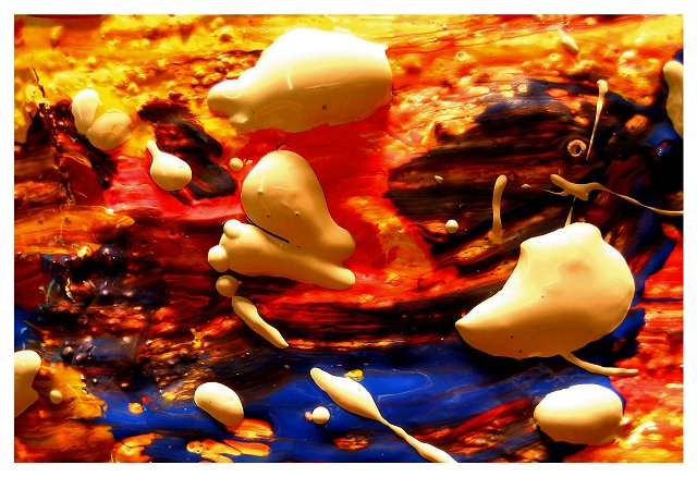
| I love this, it's real art. Leaves everyone to form their own interpretation. Great job. |
|
|
|
02/24/2004 11:36:06 AM |
|
|
|
02/23/2004 08:13:41 AM |
| super super picture. love it! Light seems a touch harsh but wonderful idea. may look into getting a print if avaliable. 10 |
|
|
|
02/22/2004 04:13:10 AM |
| I can't make out what this is supposed to be, so I can't tell what the texture is supposed to be like. |
|
|
|
02/21/2004 02:26:30 PM |
| I love the blend of color and texture here. It has a definite 3-D feel to it. |
|
|
|
02/21/2004 07:22:28 AM |
| Somehow this photograph is very disorienting.... I can't seem to get a very strong sense of its dimensions because of the different layers of paint and their individual qualities.. I guess I can't score you very highly as the subject to me (although it fits the challenge, i suppose) is not particularly interesting or exciting. 5 just the same, and I don't think it will hurt your overall score very much. |
|
|
|
02/20/2004 11:43:45 PM |
| Awesome. One of my favorites. 10 |
|
|
|
02/20/2004 11:04:25 PM |
| A little too scatered for me, I would like one main object to focus on. |
|
|
|
02/20/2004 04:33:22 PM |
| A vaguely disturbing picture. Not sure if I like it or if it makes me queasy. |
|
|
|
02/19/2004 11:40:17 PM |
| I'm curious how you did this. I'm sorry, but the orange hurts my eyes. |
|
|
|
02/19/2004 10:40:25 AM |
| This has an almost 3D effect. Good Job. There is a slight overexposure in the highlights, but the overall effect is still very good. |
|
|
|
02/19/2004 05:58:17 AM |
| Good sense of shape and feel, excellent saturation of colours: would like a capture that didn't take so many of those lines out of frame, it would feel more complete. Balance of the major areas of white paint is perhaps not terribly harmonious. |
|
|
|
02/19/2004 03:16:54 AM |
| Looks like our dinner table after the kids have eaten blueberry pie with vanilla ice, chocolate sauce & ketchup! |
|
|
|
02/19/2004 12:23:34 AM |
| I see the texture, but the subject and composition just don't hold my interest. |
|
|
|
02/18/2004 04:33:12 AM |
[World Record Attempt]
+ The colours are used to connect all the various subjects into one pleasant photo without being too distracting. Great job!
- There is a little overexposure noticable but it isn't too bad.
|
|
|
|
02/18/2004 01:10:50 AM |
| Cool colors. I think it needs a bit more blue, because it is such a rich shade, and would break up the warmer colors at the top. |
|
Home -
Challenges -
Community -
League -
Photos -
Cameras -
Lenses -
Learn -
Help -
Terms of Use -
Privacy -
Top ^
DPChallenge, and website content and design, Copyright © 2001-2025 Challenging Technologies, LLC.
All digital photo copyrights belong to the photographers and may not be used without permission.
Current Server Time: 03/12/2025 07:12:44 PM EDT.