| Author | Thread |
|
|
11/15/2007 10:31:16 AM |
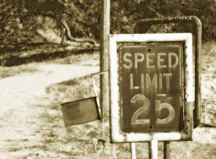
| your background is not as distracting in this one. draws attention to the sign better....great comp |
|
 Photographer found comment helpful. Photographer found comment helpful. |
|
|
11/14/2007 10:22:54 PM |
| I like the color version better because of the rust and blue paint...also there doesn't seem to be enough dark areas so the contrast is low. |
|
| Photographer found comment helpful. |
|
|
11/11/2007 11:19:26 PM |
| Oh that's great. So nostalgic. |
|
| Photographer found comment helpful. |
|
|
11/11/2007 11:14:56 PM |
| I likwe the softness of this one..... |
|
| Photographer found comment helpful. |
|
|
11/11/2007 04:58:08 PM |
| I prefer the coloured version, just because this version seems softer, due to the diffusion glow but that's great carry on experimenting with photoshop =) |
|
| Photographer found comment helpful. |
|
|
11/11/2007 03:23:21 AM |
| I think I like this version better! I agree this is NICE!! |
|
| Photographer found comment helpful. |
|
|
11/10/2007 04:09:57 PM |
| I really like the 'old' feel to this ..... good work!! |
|
| Photographer found comment helpful. |
Home -
Challenges -
Community -
League -
Photos -
Cameras -
Lenses -
Learn -
Help -
Terms of Use -
Privacy -
Top ^
DPChallenge, and website content and design, Copyright © 2001-2025 Challenging Technologies, LLC.
All digital photo copyrights belong to the photographers and may not be used without permission.
Current Server Time: 03/17/2025 06:07:06 AM EDT.