| Author | Thread |
|
|
12/18/2004 08:31:17 AM |
| I like how youve taken it |
|
 Photographer found comment helpful. Photographer found comment helpful. |
Comments Made During the Challenge  |
|
|
02/24/2004 10:45:49 PM |
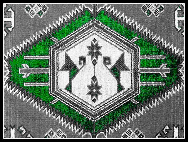
| Interesting shot, nice work of art in carpet. A different POV could improve composition and emphasize on texture. |
|
| Photographer found comment helpful. |
|
|
02/24/2004 10:52:45 AM |
| I am guessing, but I think this needs more depth of field and some slight improvements on the exposure. |
|
| Photographer found comment helpful. |
|
|
02/23/2004 08:10:02 AM |
| nice print. Think as a photo it needs more depth. |
|
| Photographer found comment helpful. |
|
|
02/22/2004 05:03:16 PM |
| more of a pattern than a texture to me |
|
| Photographer found comment helpful. |
|
|
02/22/2004 04:30:53 PM |
| neat design and frame works well |
|
| Photographer found comment helpful. |
|
|
02/20/2004 08:14:07 AM |
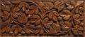
| a closer view of the carpet would have had me feel more of the texture |
|
| Photographer found comment helpful. |
|
|
02/20/2004 08:09:24 AM |
| Very nice. Texture doesn't show up a lot though - perhaps a photo from a bit lower down and angled? I can see that you were going more for the image of the design, though. |
|
| Photographer found comment helpful. |
|
|
02/20/2004 07:23:14 AM |
| I'm sorry, I find this the most abused technique around here. In a texture challnge, I can't for the life of me see the point of this selective de-saturation. Emphsising the green - this has what to do with a sense of texture, or'the interaction of light and a three dimensional surface'. 1 |
|
|
|
02/19/2004 11:17:20 PM |
| Well framed and balanced. Nicely exposed. Good luck |
|
| Photographer found comment helpful. |
|
|
02/19/2004 11:12:38 PM |
| At this angle, it's more about pattern than texture. Closer in and oblique? |
|
| Photographer found comment helpful. |
|
|
02/19/2004 10:21:44 AM |
| I see the patterns but I don't see the texture. |
|
| Photographer found comment helpful. |
|
|
02/19/2004 12:35:58 AM |
| This is a nicely composed and lighted shot. Shows great texture. I think this would look good framed. |
|
| Photographer found comment helpful. |
|
|
02/18/2004 09:30:30 AM |
| nice.. I think that green is too intense thought.. |
|
| Photographer found comment helpful. |
|
|
02/18/2004 12:47:56 AM |
| That's an interesting choice of desaturation. Would it have been possible to get a different "vantage" point in order to see the textures of the rug better. Of course, the patterns sort of set up a different kind of texture. |
|
| Photographer found comment helpful. |
Home -
Challenges -
Community -
League -
Photos -
Cameras -
Lenses -
Learn -
Help -
Terms of Use -
Privacy -
Top ^
DPChallenge, and website content and design, Copyright © 2001-2025 Challenging Technologies, LLC.
All digital photo copyrights belong to the photographers and may not be used without permission.
Current Server Time: 03/12/2025 04:29:17 PM EDT.