| Author | Thread |
|
|
02/25/2004 01:26:49 AM |
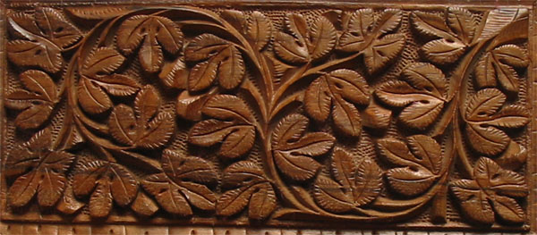
Well i will be honest, i did not shoot this for the contest, i was shooting for my work( i plan to upload those pictures soon) , i was just checking result in PS after shooting , that time i had opened DP window and i saw this contest, all i did was simply crop and that too badly.
Well i really got some nice comments despite my poor entry, i should have tried harder.
thanks for comments
Message edited by author 2004-02-25 01:32:35. |
|
Comments Made During the Challenge  |
|
|
02/24/2004 04:08:31 PM |
| it looks as though your perspective wasn't completely straight on, which created the uneven bottom. |
|
|
|
02/24/2004 01:23:32 PM |
| nice clear shot, needs cleaner crop...did you consider getting closer on a small section of the carving. Might have made a more dramatic shot. |
|
 Photographer found comment helpful. Photographer found comment helpful. |
|
|
02/23/2004 10:41:12 PM |
| nice texture, but I with you had straightened it out |
|
|
|
02/23/2004 05:42:14 PM |
| good picture, leveling before cropping would have made it better |
|
| Photographer found comment helpful. |
|
|
02/23/2004 08:04:16 AM |
| wonkey wonkey wonkey at the bottom edge. Little details like that make all the difference. |
|
| Photographer found comment helpful. |
|
|
02/22/2004 10:40:34 PM |
| Why is this photo crooked? Distracting, |
|
| Photographer found comment helpful. |
|
|
02/21/2004 04:55:55 PM |
|
| Photographer found comment helpful. |
|
|
02/21/2004 11:25:20 AM |
| This leans a little to the right... You could also have sharpened this up more to bring out so lads more details in the carvings. |
|
| Photographer found comment helpful. |
|
|
02/20/2004 09:42:28 AM |
| This certainly meets the �texture� part of the challenge, but, it could use a single point of interest to make good use of that interesting texture as background. |
|
| Photographer found comment helpful. |
|
|
02/20/2004 07:41:41 AM |
| Not enough detailing to really show the feel of the wood. Focussed well enough, but that very fine detail isn't quite coming through. Nice subject, and could have been straighter in frame really. |
|
| Photographer found comment helpful. |
|
|
02/19/2004 03:30:55 PM |
| picture could be centered better. nice |
|
| Photographer found comment helpful. |
|
|
02/19/2004 12:33:52 PM |
| The texture is here. The subject and composition lack interest to me. I think this would have been stronger if the horizontal lines were straight. |
|
| Photographer found comment helpful. |
|
|
02/19/2004 11:27:27 AM |
| A little crooked at the bottom. Subject is a little uninteresting. |
|
| Photographer found comment helpful. |
|
|
02/19/2004 08:33:07 AM |
| its ok, just lacks impact |
|
| Photographer found comment helpful. |
|
|
02/18/2004 07:16:59 PM |
| Tilted to the right a bit. |
|
| Photographer found comment helpful. |
|
|
02/18/2004 10:17:04 AM |
|
| Photographer found comment helpful. |
|
|
02/18/2004 02:08:41 AM |
| Would be nicer a little bit rotated and a more uniform light |
|
| Photographer found comment helpful. |
|
|
02/18/2004 02:08:13 AM |
| crop it tighter (lower edge needs removed). more light needed |
|
| Photographer found comment helpful. |
Home -
Challenges -
Community -
League -
Photos -
Cameras -
Lenses -
Learn -
Help -
Terms of Use -
Privacy -
Top ^
DPChallenge, and website content and design, Copyright © 2001-2025 Challenging Technologies, LLC.
All digital photo copyrights belong to the photographers and may not be used without permission.
Current Server Time: 03/12/2025 11:41:44 AM EDT.