| Author | Thread |
|
|
11/30/2007 04:24:29 PM |
| Excellent shot, congrats on the 5th place! |
|
 Photographer found comment helpful. Photographer found comment helpful. |
|
|
11/28/2007 01:46:37 PM |
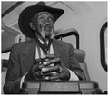
| Nice photo. I know this guy... he doesn't like to be photographed too much. I like the close crop and tone, but the cigarette really makes the photo. Cheers. |
|
| Photographer found comment helpful. |
|
|
11/28/2007 12:49:33 AM |
| Congrats on top 5, Yevgeniy. Super image! |
|
| Photographer found comment helpful. |
|
|
11/28/2007 12:14:24 AM |
| Hope they weren't hustling you! Great image and nice finish. Congratulations! |
|
| Photographer found comment helpful. |
Comments Made During the Challenge  |
|
|
11/27/2007 05:52:23 PM |
|
| Photographer found comment helpful. |
|
|
11/26/2007 10:49:48 AM |
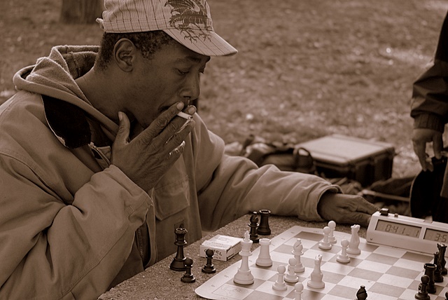
| Need a tighter set on the levels, there's no touch of white, nice composition, 6. |
|
| Photographer found comment helpful. |
|
|
11/26/2007 09:54:19 AM |
| I like the sepia tones. good. |
|
| Photographer found comment helpful. |
|
|
11/24/2007 03:16:14 PM |
| I really like the textures, and all the interesting details. Nice work! |
|
| Photographer found comment helpful. |
|
|
11/24/2007 12:52:20 PM |
| Hope to see this on the front page. Great idea and perfect in sepia. |
|
| Photographer found comment helpful. |
|
|
11/24/2007 12:44:22 AM |
| I like the contrast-I would think of a character like that playing chess out on the street. Looks like a serious game. |
|
| Photographer found comment helpful. |
|
|
11/23/2007 08:20:59 PM |
| You nailed the challenge conceptually. This would be a ten without the distractions in the background. |
|
| Photographer found comment helpful. |
|
|
11/22/2007 07:14:44 AM |
| Not a terribly good shot imo but one of the only three that actually meets the Challenge. You may very well Ribbon with this. Good Luck! |
|
| Photographer found comment helpful. |
|
|
11/21/2007 01:40:59 PM |
| good color choice. and your subject shows alot of character... a nine |
|
| Photographer found comment helpful. |
|
|
11/21/2007 11:05:07 AM |
| i like the fous on the man and the perspective - i am not sure about the sepia choice, but it's cleary one of the better entries in the challenge |
|
| Photographer found comment helpful. |
|
|
11/21/2007 07:40:22 AM |
| subject matches well, note too sure on the duotone the color is a tad too strong. composition seems lacking, would like to see more board and perhaps a bit of the opponent |
|
| Photographer found comment helpful. |
|
|
11/21/2007 01:01:56 AM |
| Nice portrait and composition. Point well made too. Other than the contrast which I think can be improved, this is a fine shot. |
|
| Photographer found comment helpful. |
|
|
11/21/2007 12:18:58 AM |
| I like the concept but the hand in the left corner is distracting, I would have cropped it out. |
|
| Photographer found comment helpful. |
Home -
Challenges -
Community -
League -
Photos -
Cameras -
Lenses -
Learn -
Help -
Terms of Use -
Privacy -
Top ^
DPChallenge, and website content and design, Copyright © 2001-2025 Challenging Technologies, LLC.
All digital photo copyrights belong to the photographers and may not be used without permission.
Current Server Time: 12/14/2025 07:27:09 PM EST.