| Author | Thread |
Comments Made During the Challenge  |
|
|
03/01/2004 07:52:09 PM |
| An age old question. A nice idea but sadly out of focus and slightly tilted. Perhaps if you straightened the shot a bit, sharpened or got better focus and not black and white, just doesn't do anything for me on this shot. A 4 |
|
|
|
03/01/2004 12:52:19 PM |
| Kinda weak on conflict--this half full/empty thing is more perception than conflict, isn't it? Exposure is grainy and OOF--maybe that's what you were going for? |
|
|
|
02/29/2004 08:35:31 PM |
|
|
|
02/28/2004 12:14:23 PM |
| Interesting idea. The picture itself is way out of focus. It doesn't convey the message of conflict by itself. |
|
|
|
02/28/2004 03:13:30 AM |
|
|
|
02/27/2004 09:52:15 PM |
| focus is a little off focus good idea though fits the challenge |
|
|
|
02/27/2004 04:08:21 PM |
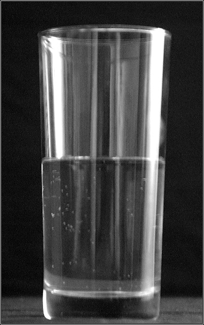
| I find the water line very interesting in this shot. The way the light is playing off the glass to make it almost look like there is another glass inside is very cool. The exposure is good although the highlights are a little bright. I like the choice of black and white and the grainyness/scratches and or bubbles on the glass. However, I don't think this conveys conflict very strongly although I do see the connection to conflicting states of mind. This is a good example of a well centered shot with a reason behind it. 6 |
|
|
|
02/27/2004 03:48:04 PM |
| I like the idea of using this age-old conflict, but poor quality. |
|
|
|
02/27/2004 02:26:57 PM |
| I like the simplicity of the idea, but it seems a little out of focus. |
|
|
|
02/27/2004 05:47:17 AM |
| Doesn't meet the challenge. |
|
|
|
02/27/2004 04:50:03 AM |
| Dont mean to be rude but everybody can take a snapshot of a glass with water in it. The lightning is poor with a distracting reflexion on the glass and the pic is blurred and unsharp. |
|
|
|
02/26/2004 08:51:34 PM |
|
|
|
02/26/2004 03:28:26 PM |
| Okay, guess I see the conflict here but don't really find this very interesting to view. Technically, it's out of focus and appears to be tilted to the right some. |
|
|
|
02/26/2004 11:50:00 AM |
| Focus would make this shot 100% better. |
|
|
|
02/26/2004 03:45:42 AM |
| good idea, but poorly framed, looks like some motion blur |
|
|
|
02/26/2004 02:42:40 AM |
| This might sound silly but not enough clarity |
|
|
|
02/26/2004 01:09:11 AM |
| I'm not really sure what's going on here. |
|
|
|
02/26/2004 12:58:44 AM |
|
|
|
02/25/2004 06:19:14 PM |
| Too much out of focus. A crisp sharp image would have been great. |
|
|
|
02/25/2004 06:00:18 PM |
|
|
|
02/25/2004 05:59:14 PM |
| seems to be a bit fuzzy but maybe you were looking for that. background could be a bit darker and the foreground a bit lighter |
|
|
|
02/25/2004 03:57:56 PM |
| A classic, though the image is a little blurry. |
|
|
|
02/25/2004 03:08:55 PM |
| Nice idea but slightly out of focus |
|
|
|
02/25/2004 02:29:34 PM |
| nice pic, but (for me) does not fit the challenge well - it doesn't say 'conflict' without an explanation. |
|
|
|
02/25/2004 02:14:10 PM |
| the out of focus is very distracting |
|
|
|
02/25/2004 12:37:21 PM |
| This is a good idea for this challenge. I think the glass needs to be a bit more in focus. Also, you may want to try the thirds rule for composition (instead of centering the subject maybe put it to the side). You may want to try using a tripod if the lighting wasn't strong enough to take the photo without handshake. |
|
 Photographer found comment helpful. Photographer found comment helpful. |
|
|
02/25/2004 12:06:28 PM |
| A bit too soft for my taste. |
|
|
|
02/25/2004 09:23:58 AM |
| The picture is out of focus. That's very distracting |
|
|
|
02/25/2004 05:03:42 AM |
|
Home -
Challenges -
Community -
League -
Photos -
Cameras -
Lenses -
Learn -
Help -
Terms of Use -
Privacy -
Top ^
DPChallenge, and website content and design, Copyright © 2001-2025 Challenging Technologies, LLC.
All digital photo copyrights belong to the photographers and may not be used without permission.
Current Server Time: 03/12/2025 02:20:15 PM EDT.