| Author | Thread |
|
|
05/21/2008 09:50:03 AM |
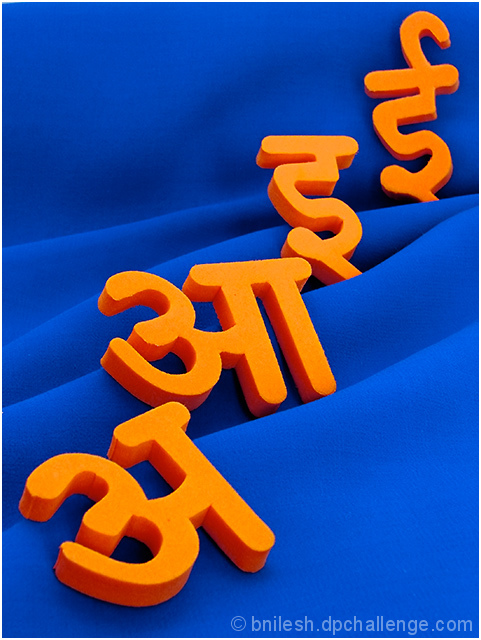
My first thought was a different language, which unsettled me a little.
The idea is excellent, and I love the strong complimentary colors are bold and well placed.
I am not sure why the voters did not mark this higher, as it is a well balanced image, and fits the challenge well.....
I like the folds in the material, and also the crop.
|
|
 Photographer found comment helpful. Photographer found comment helpful. |
|
|
05/21/2008 05:07:29 AM |
waves on fabric are superb...
there seems shadow on last letter "e"..... if that can be avoided, the there would be only two complimentory colors in the pic... IMO....
great idea... |
|
| Photographer found comment helpful. |
Comments Made During the Challenge  |
|
|
12/03/2007 02:46:43 AM |
| Now this is complimentary as it gets. I really like the waves in the fabric and the letters at different angles. |
|
| Photographer found comment helpful. |
|
|
12/02/2007 12:37:17 PM |
| Nice and bold, good comp. I wonder if side lighting a touch more would give it some more impact. |
|
| Photographer found comment helpful. |
Home -
Challenges -
Community -
League -
Photos -
Cameras -
Lenses -
Learn -
Help -
Terms of Use -
Privacy -
Top ^
DPChallenge, and website content and design, Copyright © 2001-2025 Challenging Technologies, LLC.
All digital photo copyrights belong to the photographers and may not be used without permission.
Current Server Time: 03/12/2025 02:34:06 AM EDT.