| Author | Thread |
|
|
12/10/2007 10:34:57 PM |
| This was a very good idea, but very hard to pull off without specialized equipment: light box, lamps, special lens, and of course Photoshop. You can accomplish good things without all the equipment, and this is the place to learn. Enter often, try new things, read the forums and tutorials, and don't be discouraged. Most importantly, have fun. |
|
Comments Made During the Challenge  |
|
|
12/04/2007 02:19:17 PM |
|
 Photographer found comment helpful. Photographer found comment helpful. |
|
|
12/04/2007 10:28:06 AM |
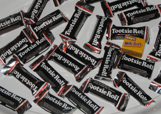
| It's not very sharp and the lighting needs some work. The subject is almost on the thirds intersection though. Much better than centering it. |
|
| Photographer found comment helpful. |
|
|
12/04/2007 06:08:47 AM |
| I like the title, I think the light could use a little work, maybe even just a slight levels adjustment to brighten the highlights. |
|
| Photographer found comment helpful. |
|
|
12/03/2007 02:44:47 PM |
Technically it fit's the challenge - it just short on 'Wow' factor.
The colours black and yellow really ought to go together very well, but I think the vibrance is a little diluted by the amount of white space we see from the surface below. Good try though |
|
| Photographer found comment helpful. |
|
|
12/03/2007 03:45:31 AM |
| Original but not very inspiring! |
|
| Photographer found comment helpful. |
|
|
12/01/2007 04:12:56 PM |
| The lighting seems a bit harsh, probably b/c of the refective rappers and glossey plate that they sit upon. Maybe diffusing the light and using a solid white non-reflective background might have given this a softer appearance. |
|
| Photographer found comment helpful. |
|
|
11/30/2007 11:32:34 PM |
| you idea is good but I think it might have worked better if you had filled the frame with tootsie rolls and eliminate the white plate. |
|
| Photographer found comment helpful. |
|
|
11/29/2007 07:59:05 PM |
| I like it! Most clever! 6 |
|
| Photographer found comment helpful. |
|
|
11/29/2007 09:35:58 AM |
|
| Photographer found comment helpful. |
|
|
11/29/2007 06:26:20 AM |
| The composition could have been better if you could arrange the Tootsie Roll nicely to form a pattern. This looks like a mess. |
|
| Photographer found comment helpful. |
|
|
11/28/2007 09:54:02 PM |
lighting is exceedingly flat
white should be white not the gray it is |
|
| Photographer found comment helpful. |
|
|
11/28/2007 08:58:19 PM |
| i think the composition would have benefitted a more natural randomness. like throwing up the tootsie rolls and letting them fall as the may. then placing the milk duds per the rule of thirds as it's current placement feels unnecessarily awkward to me. finally a white balance adjustment or contrast boost would be cool to brighten the pic as it looks a bit drab at the moment. just a personal opinion...feel free to luge on my profile page. |
|
| Photographer found comment helpful. |
|
|
11/28/2007 05:56:36 PM |
|
| Photographer found comment helpful. |
|
|
11/28/2007 12:20:44 PM |
|
| Photographer found comment helpful. |
Home -
Challenges -
Community -
League -
Photos -
Cameras -
Lenses -
Learn -
Help -
Terms of Use -
Privacy -
Top ^
DPChallenge, and website content and design, Copyright © 2001-2025 Challenging Technologies, LLC.
All digital photo copyrights belong to the photographers and may not be used without permission.
Current Server Time: 04/26/2025 01:55:48 PM EDT.