| Author | Thread |
|
|
03/15/2004 02:17:13 PM |
Taking a picture of another's art is akin to stealing in my book.
Sound familar ? Is this any different than my statue photo ? I think not :) |
|
|
|
03/03/2004 09:59:10 AM |
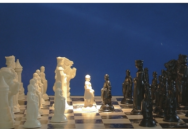
| The 'mysterious' white bar was some kind of Photoshop 'gift'. I have no idea how it got there or why i didn't see it. The lighting was not as good as i had hoped for, but the best i was ablt to achieve. I am still learning! The spot light was sipposed to be equallyon the two pawns, but black is a tough color to light, especially so next to white. Thanks to all those that commented. |
|
Comments Made During the Challenge  |
|
|
03/02/2004 10:50:12 PM |
| Interesting shot, beautiful light effect. |
|
|
|
03/02/2004 12:41:41 AM |
The very first thing I see in this shot is the mysterious white bar across the top of the shot. Is this intentional (if so I have no idea what it means) or did you crop to far? The center pawn is overexposed. Your composition is good, but I think a reshoot would be a good exercise!
TC |
|
|
|
02/28/2004 09:58:23 AM |
|
|
|
02/28/2004 03:09:08 AM |
|
|
|
02/28/2004 02:25:08 AM |
| Why leave the white strip at the top? Also, I might have put the spotlight on the two pawns. |
|
|
|
02/27/2004 03:51:16 PM |
| love the idea of the spotlight, but the composition seems a litte poor, sorry! I think it comes from the lighting as a whole, it's a bit weak. 4. |
|
|
|
02/27/2004 07:39:38 AM |
| Clever lighting. Don't like the white stripe across the top .... intentional??? |
|
|
|
02/26/2004 10:19:19 PM |
|
|
|
02/26/2004 09:27:16 PM |
| Good concept, but I think the blue background takes away from the drama of the shot. Also white speckles are distracting. Go for black and white or sepia for this one. |
|
|
|
02/26/2004 08:39:07 PM |
| nice lighting.....high-lighting the Good one.... |
|
|
|
02/26/2004 12:16:16 PM |
| This was a great idea, but too much blue, a creative cropping of this photo would have been nicer to keep my attention, I can't get pasted the blue. |
|
|
|
02/25/2004 08:49:31 PM |
|
|
|
02/25/2004 08:44:49 PM |
| I think that shooting this from above would have made it work better. |
|
|
|
02/25/2004 06:40:47 PM |
| the lighting makes this piece work |
|
|
|
02/25/2004 02:08:00 PM |
|
|
|
02/25/2004 10:42:09 AM |
| Great colors and lighting. Good idea. |
|
|
|
02/25/2004 05:29:21 AM |
| A very good expression of humanity' most ancient conflict is a domesticated form.Experts would say there is too much light given on the white chess -figures in the middle and they would be right.The idea is very good, worth of a few more experiments. |
|
 Photographer found comment helpful. Photographer found comment helpful. |
|
|
02/25/2004 04:44:48 AM |
| Isn't it just black vs. white? :-) Nice pic. |
|
|
|
02/25/2004 12:37:17 AM |
| this is damn neat, nice lighting. |
|
Home -
Challenges -
Community -
League -
Photos -
Cameras -
Lenses -
Learn -
Help -
Terms of Use -
Privacy -
Top ^
DPChallenge, and website content and design, Copyright © 2001-2025 Challenging Technologies, LLC.
All digital photo copyrights belong to the photographers and may not be used without permission.
Current Server Time: 03/12/2025 11:27:41 AM EDT.