| Author | Thread |
|
|
03/14/2004 01:15:53 AM |
Greeetings from the critique club.
Hits: Good idea! The sun is well captured, with good aesthetics and pleasing tones.
Misses: The foreground exposure is too dark and that's a pity because the sillouettes would have been quite striking in combination with the sun. Also, as perfectly exposed as the sun is here, it doesn't have the fiery drama it might if it were "brighter".
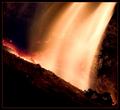
Suggestions: You can probably adjust up a stop's worth in PS. I had thought about using the sun; the sunset itself can really be fiery! I have a couple of good examples. Examples
Take this one for example:

Now that shows fire! But of course, I was just lucky to be out with my camera in that sunset. Nonetheless, the point I am making is that by underexposing by two stops, you have removed some of the fiery punch of the sun. Take this second example, a simple sunset, exposed less conservatively:

Note that while the sun itself is not clear here, it is much more "fiery" as is the sky.
Now that may not have been what you were going for, and you have done a great job of capturing the sun, if not "fire"! (Reminds me a bit of the opening for the series "Kung Fu").
Regards--Neil |
|
|
|
03/08/2004 09:43:11 AM |
Nice shot. Having the big sun with no light has a strong effect on me. I like the buildings. They add some movement to the picture. Trykinn offered a suggestion that, I believe, would have brought this up from the average score it received. The noise might have been a problem with the score also. A lot of dpc'ers like a buttery smooth look. Have you tried neat image? It can be used without destroying the details if done right. On a picture like this, without small details, it is the perfect solution.
Congrats on your first entry! Good luck on your future challenges. |
|
 Photographer found comment helpful. Photographer found comment helpful. |
Comments Made During the Challenge  |
|
|
03/06/2004 09:42:21 AM |
|
| Photographer found comment helpful. |
|
|
03/05/2004 09:22:07 PM |
| I liked the composition of this shot and am suprised there were not more sun images. I had to download the picture to see the foreground (I need to sort out my monitor). the red sky at the top seems a too manipulated, maybe its my monitor again? |
|
| Photographer found comment helpful. |
|
|
03/04/2004 05:14:10 PM |
|
| Photographer found comment helpful. |
|
|
03/03/2004 07:30:35 PM |
| Very good work! It's surreal how the sun just sits there without really illuminating the landscape. - 7 |
|
| Photographer found comment helpful. |
|
|
03/03/2004 04:44:28 PM |
| Pretty! It's easy to forget that the Sun is the mother of all fires, at least in this solar system! |
|
| Photographer found comment helpful. |
|
|
03/03/2004 08:52:51 AM |
| Great idea and beautiful shot. |
|
| Photographer found comment helpful. |
|
|
03/02/2004 07:40:17 AM |
| Nice picture. sure is a big moon. |
|
| Photographer found comment helpful. |
|
|
03/01/2004 07:32:16 PM |
| Puting the windmill on top of the sun might have looked cool, the structures are a bit dark |
|
| Photographer found comment helpful. |
|
|
03/01/2004 04:43:46 PM |
| When the sun is low and heavy and red it's certainly most redolent of fire - certainly more so than the little pinprick of pale yellow I've glimpsed around here lately... An interesting silhouette. |
|
| Photographer found comment helpful. |
Home -
Challenges -
Community -
League -
Photos -
Cameras -
Lenses -
Learn -
Help -
Terms of Use -
Privacy -
Top ^
DPChallenge, and website content and design, Copyright © 2001-2025 Challenging Technologies, LLC.
All digital photo copyrights belong to the photographers and may not be used without permission.
Current Server Time: 03/12/2025 08:30:09 PM EDT.