| Author | Thread |
|
|
01/28/2008 06:04:46 PM |
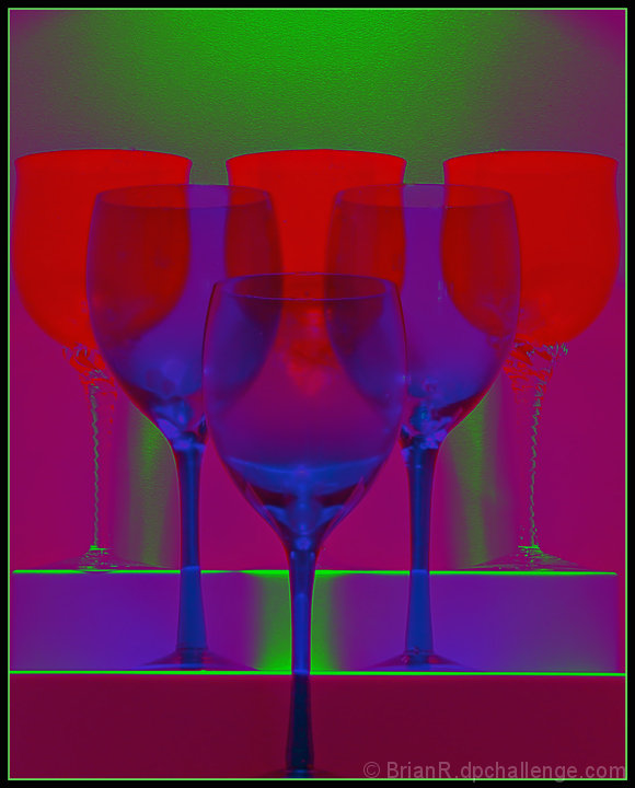
I love how you did this one, and the composition, Idea, and design is just brilliant.
Not to sure of the color but I really like this and it should have received a much higher score..... |
|
 Photographer found comment helpful. Photographer found comment helpful. |
|
|
01/28/2008 01:17:44 PM |
| I really like this image very much too, Brian. It looks very modern and I can imagine it hanging as a print in a modern living room. Very creative. |
|
| Photographer found comment helpful. |
|
|
01/28/2008 10:18:57 AM |
| Brian, I really like this image. I gave it a 7 during voting. I thought you had used a gradient map adjustment layer to get the effect. I often play with that layer myself. It's interesting to read about your processing. At any rate, no matter how you did it, I like the product. It would be great in very large format on a wall in a modern loft. |
|
| Photographer found comment helpful. |
|
|
01/28/2008 09:38:38 AM |
| Very unique colors. Very brilliant. I like the way the cups are being shown through one another. Good job with this one. |
|
| Photographer found comment helpful. |
Comments Made During the Challenge  |
|
|
01/27/2008 09:36:47 AM |
| Way over processed. I see what you were going for but it was overdone. |
|
| Photographer found comment helpful. |
|
|
01/27/2008 07:35:55 AM |
| I like the black light effect, but I think your title is a bit off, it should be, �Red-Green-Blue, What it is� |
|
| Photographer found comment helpful. |
|
|
01/25/2008 10:56:33 PM |
| The colors look way over done, like you pumped the saturation too much in PS. |
|
| Photographer found comment helpful. |
|
|
01/24/2008 08:42:49 PM |
| The colors, set-up, lighting - all super. |
|
| Photographer found comment helpful. |
|
|
01/24/2008 07:51:01 AM |
| I think you're going to get a lot of 1's for this. I'm not sure if anyone will go to the trouble to comment so i'll see what I can do. The first thing struck me was that it looked like your monitor or camera screwed up the colours. My second thought was that this was terrible, and the main reason being that you had a nice pic, but ruined it with the colouring method. I think it would have worked with the glasses filled with red, green or blue liquid and then gone from there. As it is, it's muddy, badly defined and it's hard to see the shapes within the frame. I'm sure you had an idea in mind when you took the shot, but i'm not sure if this was it. But hey, i didn't even enter! |
|
| Photographer found comment helpful. |
|
|
01/21/2008 10:11:05 PM |
| What's causing the light green line around the red glasses? |
|
| Photographer found comment helpful. |
|
|
01/21/2008 09:56:21 PM |
| Very Warhol-ish, but almost 'too much' on the eyes. Needs to be toned down abit to be a bold but easy to focus on as well. Very creative though. |
|
| Photographer found comment helpful. |
Home -
Challenges -
Community -
League -
Photos -
Cameras -
Lenses -
Learn -
Help -
Terms of Use -
Privacy -
Top ^
DPChallenge, and website content and design, Copyright © 2001-2025 Challenging Technologies, LLC.
All digital photo copyrights belong to the photographers and may not be used without permission.
Current Server Time: 03/16/2025 11:14:53 PM EDT.