| Author | Thread |
|
|
03/17/2004 12:33:23 AM |
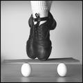
Here's the original...

Message edited by author 2004-03-17 00:34:05. |
|
Comments Made During the Challenge  |
|
|
03/13/2004 07:37:02 AM |
|
|
|
03/12/2004 10:52:08 AM |
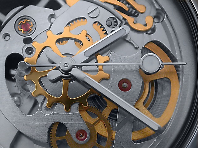
| lighting seems a bit uneven, flash? |
|
|
|
03/12/2004 07:49:25 AM |
| nice composition, well lit |
|
|
|
03/11/2004 10:47:21 PM |
| Nice lighting, yet the depth of field could be slightly wider~ |
|
|
|
03/11/2004 12:25:09 PM |
| Very nice macros, focus is a bit soft, contrasting colors are very nice |
|
|
|
03/10/2004 02:40:38 PM |
Great lighting, detail and colors. 8
Good luck... |
|
|
|
03/09/2004 02:14:44 PM |
| The angle of lighting could be better, more direct. The contrast could be brought up a tiny bit too |
|
|
|
03/09/2004 09:03:03 AM |
| Wonderfully observed and creative use of colour and (perhaps?) desaturation. My onyl suggestions for improvement would be a more direct angle on the shot. The fact that the watch is partly tilted away from the camera will be one reason why the gold coloured mechanisms at the top are out of focus. This makes a 9 out of a potential 10 |
|
|
|
03/08/2004 07:44:37 PM |
|
|
|
03/08/2004 01:07:44 PM |
| Pretty colors. Lovely light and super focus. Nice entry. |
|
|
|
03/08/2004 12:12:32 PM |
| Somehow the title doesn't add to your photograph. |
|
|
|
03/08/2004 04:06:18 AM |
|
|
|
03/08/2004 01:29:29 AM |
| nice color.. and almost great detail. i think it would benefit from the entire image being in focus... but nice image. |
|
Home -
Challenges -
Community -
League -
Photos -
Cameras -
Lenses -
Learn -
Help -
Terms of Use -
Privacy -
Top ^
DPChallenge, and website content and design, Copyright © 2001-2025 Challenging Technologies, LLC.
All digital photo copyrights belong to the photographers and may not be used without permission.
Current Server Time: 03/12/2025 06:39:08 PM EDT.