| Author | Thread |
|
|
03/26/2008 10:21:10 AM |
| Just looking through your portfolio of entries. All your photos are thought out in some way. You have a certain attention to the idea which seems to be the priority - over the "looks" of the photo. I can understand that. There's a logic there and it's interesting to see how your photo skills are developing. When you comment on other photos here you also seem to look and learn. Keep up the good work or learning and I hope you enjoy this hobby... |
|
Comments Made During the Challenge  |
|
|
02/19/2008 09:49:17 PM |
| seems a bit oof and the lighting seems a bit harsh, maybe bouncing the flash could help eliminate the harsh shadows. |
|
|
|
02/19/2008 09:23:33 AM |
| Pretty neat creation. However, the photograph could use some help. DOF needs to be a bit more and the pieces on top have some blown out spots, probably from the flash. |
|
|
|
02/18/2008 09:34:20 PM |
| The lighting on this is a little off. I also think it could a benefited from a different angle. Also when you use your editing software adjusting the contrast might help to draw out some of the detail in the bread and give the appearance of a sharper image. |
|
|
|
02/15/2008 10:57:05 PM |
| good idea but not enough of the photo is in focus, the shadows are a bit distracting and I think a background other than the white might have given it a bit better contrast |
|
|
|
02/15/2008 03:27:39 PM |
| creative. The image could be sharper, & the background could show more contrast. Also, the shadow detracts from the whole. Good composition. |
|
|
|
02/15/2008 02:36:14 AM |
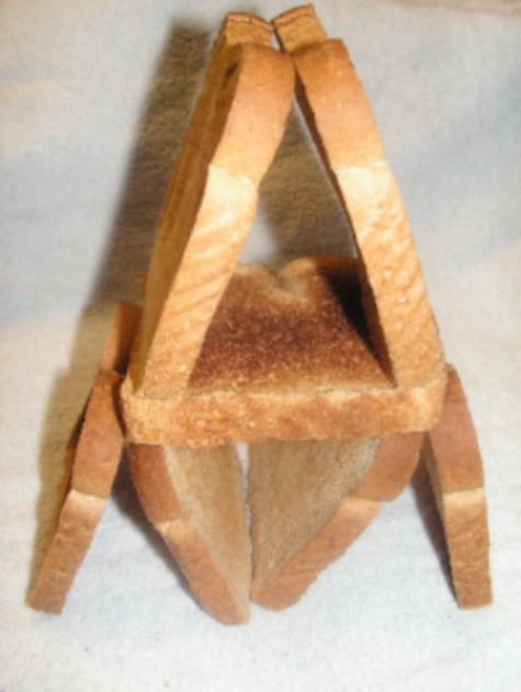
Wow, heat treatment for strength.
Image would have been better composed without the shadow. |
|
|
|
02/14/2008 09:27:21 PM |
| A greater depth of field would help this image |
|
|
|
02/13/2008 09:19:42 PM |
Message edited by author 2008-03-03 18:47:06. |
|
|
|
02/13/2008 09:08:57 PM |
| poor quality photo, not very exciting composition either |
|
|
|
02/13/2008 03:38:37 PM |
| nothing seems to be in focus |
|
Home -
Challenges -
Community -
League -
Photos -
Cameras -
Lenses -
Learn -
Help -
Terms of Use -
Privacy -
Top ^
DPChallenge, and website content and design, Copyright © 2001-2025 Challenging Technologies, LLC.
All digital photo copyrights belong to the photographers and may not be used without permission.
Current Server Time: 03/12/2025 11:57:29 PM EDT.