| Author | Thread |
|
|
06/21/2008 08:40:44 PM |
| Excellent crop once again and leaves me wanting more and wondering what is around that corner. Excellent and so strong..... |
|
 Photographer found comment helpful. Photographer found comment helpful. |
|
|
02/20/2008 04:39:39 PM |
Well waddya know... :) Great to discover this one was yours. I thought the same as  raish when I first saw this. Many print uses for it and you should seriously consider for stock. Way to go girly! raish when I first saw this. Many print uses for it and you should seriously consider for stock. Way to go girly! |
|
| Photographer found comment helpful. |
Comments Made During the Challenge  |
|
|
02/19/2008 12:55:56 PM |
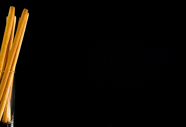
| I'm sure some people love it, but for me, there's too much empty space. It's probably good if you are going to have an ad made out of it. I do love the clarity of the sticks and how well they contrast against the dark background. |
|
| Photographer found comment helpful. |
|
|
02/18/2008 10:17:16 PM |
| Great use of negative space, my favorite so far. |
|
| Photographer found comment helpful. |
|
|
02/18/2008 05:09:02 PM |
| more than a minimalist photo is a minimal photo. the subject on the left border and the black that fill the frame have a true charm. the only little problem that I can see is the very small reflection on the low side of the glass. 7 |
|
| Photographer found comment helpful. |
|
|
02/18/2008 02:00:18 AM |
| I know the point is about the negative space, but I find myself wanting to see more. Maybe that's a good thing..? |
|
| Photographer found comment helpful. |
|
|
02/17/2008 05:37:34 AM |
| nice diea. I'd probably suggest cutting out *some* of the black space though. |
|
| Photographer found comment helpful. |
|
|
02/16/2008 06:53:46 PM |
| I like the lighting on the breadsticks, and I appreciate the experimental cropping, but... might been better cropped as a vertical. You still could've left lots of black on the left, just not as much as in this horizontal arrangement. |
|
|
|
02/15/2008 11:51:57 PM |
| good color contrast, but I think the bread should have been more in the frame. |
|
| Photographer found comment helpful. |
|
|
02/14/2008 10:00:43 PM |
|
| Photographer found comment helpful. |
|
|
02/14/2008 04:21:20 PM |
|
| Photographer found comment helpful. |
|
|
02/14/2008 12:59:07 PM |
|
| Photographer found comment helpful. |
|
|
02/14/2008 11:58:51 AM |
| too much blank space, but i understand what you were trying for |
|
| Photographer found comment helpful. |
|
|
02/14/2008 11:10:48 AM |
| The straight lines, the simplicity of the shot is good. Love the negative space that you have gone for, it really makes stand out from the others. Wish the light bounce at the end of the glass was not there though. 9 |
|
| Photographer found comment helpful. |
|
|
02/14/2008 06:18:14 AM |
| A very daring use of negative space which doesn't quite work for me - there's no real interaction between the subject and the space and there's just so much space! I also wonder if this is a little oversharpened (the jaggies on the breadsticks are a little distracting). Good effort though. |
|
| Photographer found comment helpful. |
|
|
02/14/2008 01:52:38 AM |
| Nice idea and lighting. I would like to see more of the bottom of the bread sticks and the cup that is holding them |
|
| Photographer found comment helpful. |
|
|
02/13/2008 09:17:36 PM |
| I like the extreme composition. |
|
| Photographer found comment helpful. |
|
|
02/13/2008 06:39:46 PM |
| Gutsy crop, good thinking |
|
| Photographer found comment helpful. |
|
|
02/13/2008 04:52:03 PM |
| I like your idea... bit it is waaaaay too much room for more! 5 |
|
| Photographer found comment helpful. |
|
|
02/13/2008 03:57:42 PM |
good idea - but way too much dead space.
If you could bring the breadsticks in a bit more so we can see them properly, then lose about half of the black, then (for me) this would be much stronger.
But I can certainly see where you were going with it. |
|
| Photographer found comment helpful. |
|
|
02/13/2008 03:14:31 PM |
| I am a sucker for minimalism and just love empty space. But this one does not work for me, because your subject is too far to the edges of the pic. This would have worked so much better if you left some room around the subject instead of just to the right of it. Execution is fine though. |
|
| Photographer found comment helpful. |
|
|
02/13/2008 11:42:31 AM |
| Interesting representation of the gulf between the content of this picture and bread. Very stylish and should look good in a coffee table magazine. |
|
| Photographer found comment helpful. |
|
|
02/13/2008 07:30:57 AM |
| too blank....I know that is the point but seeing so much black overpowers the breadsticks. |
|
| Photographer found comment helpful. |
Home -
Challenges -
Community -
League -
Photos -
Cameras -
Lenses -
Learn -
Help -
Terms of Use -
Privacy -
Top ^
DPChallenge, and website content and design, Copyright © 2001-2025 Challenging Technologies, LLC.
All digital photo copyrights belong to the photographers and may not be used without permission.
Current Server Time: 03/11/2025 02:45:13 PM EDT.