| Author | Thread |
Comments Made During the Challenge  |
|
|
03/10/2008 08:07:07 PM |
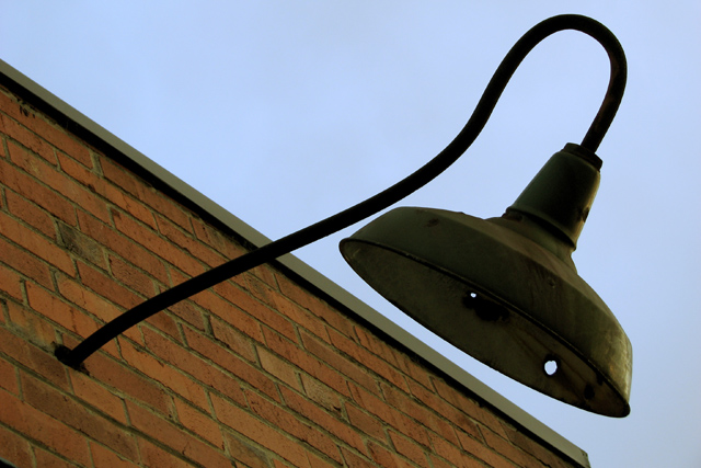
| To dark in some areas, and flat in others. The bricks dont have much of a texture, and you cant see enough of the lamp as it is lost in shaddow. More contrast would also help |
|
 Photographer found comment helpful. Photographer found comment helpful. |
|
|
03/10/2008 09:18:52 AM |
| Although I know it is, this angle doesn't make it seem titled. It just seems like I'm looking up. |
|
| Photographer found comment helpful. |
|
|
03/08/2008 06:24:51 AM |
| I can see how you tried to balance this image, but the color and light really need more oomph, especially with such a simplistic subject. Could be sharper, too. |
|
| Photographer found comment helpful. |
|
|
03/07/2008 08:53:39 PM |
| I really like the composition. |
|
| Photographer found comment helpful. |
|
|
03/07/2008 11:51:41 AM |
|
| Photographer found comment helpful. |
|
|
03/05/2008 03:58:50 PM |
| Interesting! The angles really work and I like how they are angles I might see in real life (rather than rotated for the sake of it). The crossing diagonals work well. |
|
| Photographer found comment helpful. |
Home -
Challenges -
Community -
League -
Photos -
Cameras -
Lenses -
Learn -
Help -
Terms of Use -
Privacy -
Top ^
DPChallenge, and website content and design, Copyright © 2001-2025 Challenging Technologies, LLC.
All digital photo copyrights belong to the photographers and may not be used without permission.
Current Server Time: 03/11/2025 03:00:15 PM EDT.