| Author | Thread |
|
|
04/02/2004 09:40:03 AM |
Greetings from the Critque Club.
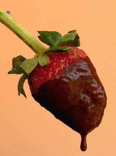
A very tastefull subject, the image is sharp and clear. The composition is well throughthru, but the backgroud color is a bit too "dull" and takes away some focus of the actual subject. You could have increased brightness and contrast, and maybe used a multicolor background?
Good use of light, maybe a little more reflection would have improved the overall picture.
But overall, a very well done image. |
|
Comments Made During the Challenge  |
|
|
03/27/2004 05:46:10 PM |
| not a fan of the chocolate and strawberry combo, but it looks quite tasty and your lighting of it was very good....the background does nothing for me or the subject, IMHO. |
|
 Photographer found comment helpful. Photographer found comment helpful. |
|
|
03/27/2004 01:17:56 PM |
I would say that this could be a better photo with a different colored background. Also, did you use that chocolate sauce that you melt in the microwave? It generally looks that course. True dipping chocolate is smoother and I think you could have had a better result.
The best thing is the composition of the subject. I like that alot.
|
|
| Photographer found comment helpful. |
|
|
03/26/2004 10:19:02 PM |
| Good shot but I really don't like the orange background as it makes your subject flat. A black background would have been perfect. |
|
| Photographer found comment helpful. |
|
|
03/26/2004 12:31:28 PM |
| I hate to be negative.For some reason, I found this has to be the most unapplealing shot's of a strawberry. The lighting is off it has a real dead spot on the lower left . you could try using a reflector oruse more lights to mold the berry bette and make it mor 3 dimensionalr. it is the color of the background that might be adding to my feeling about this shot. Normally don't give comment , you had a good idea. I'd give it another whirl using more light and experimenting with the background color. |
|
| Photographer found comment helpful. |
|
|
03/26/2004 12:08:20 PM |
| Nice shot, and a good magazine cover, with a vertical format and space at the top that could carry type without spoiling the picture. |
|
| Photographer found comment helpful. |
|
|
03/25/2004 01:57:31 PM |
| Looks delicious, picturewise too. |
|
| Photographer found comment helpful. |
|
|
03/24/2004 08:16:04 PM |
|
| Photographer found comment helpful. |
|
|
03/24/2004 09:39:14 AM |
| i think a better background color could have been used. |
|
| Photographer found comment helpful. |
|
|
03/23/2004 08:55:14 PM |
| The background color is a little distracting to me. |
|
| Photographer found comment helpful. |
|
|
03/22/2004 05:25:15 PM |
| top photo, buy any magazine with a photo on the cover like yours - wel done |
|
| Photographer found comment helpful. |
|
|
03/22/2004 05:15:12 PM |
| The drop looks a little edgy but a very nice shot nonetheless. |
|
| Photographer found comment helpful. |
|
|
03/22/2004 05:11:44 PM |
| The background color does not work for me. |
|
| Photographer found comment helpful. |
|
|
03/22/2004 03:14:51 PM |
| Great shot, I can see the space you've left for text / features etc. I think a little more light on the strawberry would have helped. Anyway, well done on meeting the challenge unlike many others. |
|
| Photographer found comment helpful. |
|
|
03/22/2004 02:59:47 PM |
| I like the idea of using an actual magazine cover as inspiration. My recommendations would be to use better chocolate to provide a smoother surface (I use toll house dark chocolate morsels melted in the microwave under low power when I dip strawberries. Only heat for 10-15 seconds at a time and stir between heatings, it tends to burn quickly). Also, the background is to monotonous. Something with a bit of texture would have added some depth. |
|
| Photographer found comment helpful. |
|
|
03/22/2004 06:44:37 AM |
|
| Photographer found comment helpful. |
Home -
Challenges -
Community -
League -
Photos -
Cameras -
Lenses -
Learn -
Help -
Terms of Use -
Privacy -
Top ^
DPChallenge, and website content and design, Copyright © 2001-2025 Challenging Technologies, LLC.
All digital photo copyrights belong to the photographers and may not be used without permission.
Current Server Time: 04/26/2025 10:21:44 AM EDT.