| Author | Thread |
|
|
03/29/2004 02:05:27 PM |
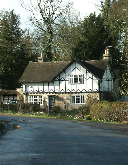
| well seems I took the challenge instructions too literally, leaving room top and bottom of the image for text. When just any photo entry would do it seems even if the pic is landscape. Live and learn.... |
|
Comments Made During the Challenge  |
|
|
03/27/2004 09:48:04 PM |
| I would prefer to see less pavement in this photo and more "country". |
|
 Photographer found comment helpful. Photographer found comment helpful. |
|
|
03/26/2004 12:34:46 AM |
| Neat looking place. I would have cropped out about half of that drive and I would have tilited the photo a bit to the right, which I think would straighten up the house some. Hmm...then maybe the tree would be "off". I can envision this on the cover. |
|
| Photographer found comment helpful. |
|
|
03/25/2004 06:55:21 PM |
| The photo is not completely clear, and the color is a bit washed. I'd consider it at sunset or add more contrast :) |
|
| Photographer found comment helpful. |
|
|
03/25/2004 06:00:51 PM |
| This photo does very little for me. The house has been placed unimaginatively right in the centre of the frame, but just off enough for this to look haphazard. The house blends in the background too much, and there is not enough sharpness in the shot. My main gripe is that this is a shot that looks like anyone could have taken it. Look for unusual angles and textures. How could you simplify the composition here? There is simply too much going on in this shot that looks like it hasn't been thought about. What makes this house special? What can lift this shot out of the ordinary? |
|
|
|
03/25/2004 03:27:06 PM |
| A bit less foreground may look better, good picture though. |
|
| Photographer found comment helpful. |
|
|
03/22/2004 07:40:24 PM |
| The wet pavement just adds to this well composed shot (w/ lots of room for title and text) All that's missing is a punchier sky. One of my favorites this challenge |
|
| Photographer found comment helpful. |
Home -
Challenges -
Community -
League -
Photos -
Cameras -
Lenses -
Learn -
Help -
Terms of Use -
Privacy -
Top ^
DPChallenge, and website content and design, Copyright © 2001-2025 Challenging Technologies, LLC.
All digital photo copyrights belong to the photographers and may not be used without permission.
Current Server Time: 04/26/2025 05:32:04 PM EDT.