| Author | Thread |
Comments Made During the Challenge  |
|
|
03/25/2008 10:59:41 AM |
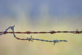
| Nice image. The seems to be a blue hue on the fence rails not sure if it is natural or not but in either case it is a bit of a distraction, my eye kept wondering back to this. |
|
 Photographer found comment helpful. Photographer found comment helpful. |
|
|
03/24/2008 11:39:55 PM |
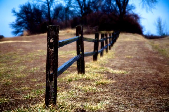
| I like the colours and narrow dof. |
|
| Photographer found comment helpful. |
|
|
03/24/2008 03:09:31 PM |
| Nice image. As it is, I find the bright sky very distracting, but cropping both the left and the right eliminates this as well as focus the image more on the fence and makes it much stronger. |
|
| Photographer found comment helpful. |
|
|
03/24/2008 12:37:50 PM |
| I like the idea, but the blue cast is very overwhleming. |
|
| Photographer found comment helpful. |
|
|
03/22/2008 09:40:04 PM |
| I love the rich colors here, very nice. |
|
| Photographer found comment helpful. |
|
|
03/21/2008 01:45:55 PM |
| i like the tones in this...and love that blue sky! |
|
| Photographer found comment helpful. |
|
|
03/20/2008 07:41:38 PM |
| I like the green tufts of grass and the concept, however I feel the DOF is too shallow... and even the first post looks a little OOF... just a fraction |
|
| Photographer found comment helpful. |
|
|
03/19/2008 01:53:57 PM |
| I think if the fence were off to the left more and we could follow the fence through the photo it would be a much stronger image. Even cropping out the left dead space helps. As it is, it looks like the photo is of the landscape and it has a fence in it. The other way the photo would definitely say "fence". |
|
| Photographer found comment helpful. |
|
|
03/19/2008 08:37:32 AM |
| The blue looks too saturated. It gives a strange cast on the fence. |
|
| Photographer found comment helpful. |
Home -
Challenges -
Community -
League -
Photos -
Cameras -
Lenses -
Learn -
Help -
Terms of Use -
Privacy -
Top ^
DPChallenge, and website content and design, Copyright © 2001-2025 Challenging Technologies, LLC.
All digital photo copyrights belong to the photographers and may not be used without permission.
Current Server Time: 03/16/2025 07:41:39 PM EDT.