| Author | Thread |
Comments Made During the Challenge  |
|
|
04/01/2008 09:36:35 PM |
| would have been nicer in color... |
|
|
|
04/01/2008 09:45:10 AM |
|
|
|
03/30/2008 02:41:41 PM |
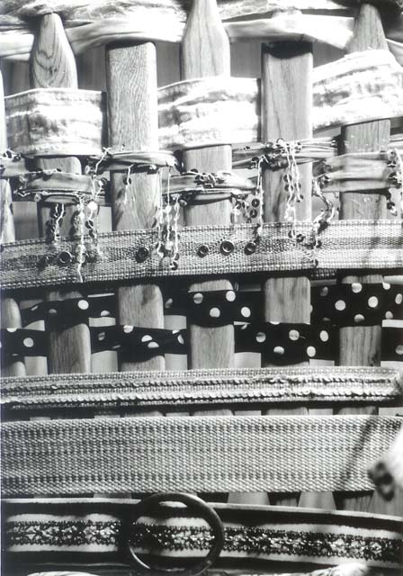
| Good idea lots of pattern good contrast |
|
 Photographer found comment helpful. Photographer found comment helpful. |
|
|
03/30/2008 06:12:02 AM |
|
|
|
03/29/2008 09:29:01 PM |
| I think this is over-exposed. |
|
|
|
03/28/2008 10:24:24 PM |
| good idea but far too many items competing for the spotlight. Less means more impact if shot well. |
|
| Photographer found comment helpful. |
|
|
03/28/2008 08:49:52 PM |
| A little difficult to score this image, I like certain parts of the image (the middle portion) but not the entire image. The overblown top portion is distracting & the little blurred portion on the lower right is also distracting. I would probably have cropped tighter leaving out the top & bottom portions. |
|
| Photographer found comment helpful. |
|
|
03/27/2008 12:08:05 PM |
| Got it! You used different patterns (& textures) to create the shot. Honestly, I would have liked to see the colors as well. |
|
| Photographer found comment helpful. |
|
|
03/27/2008 09:28:29 AM |
| nice picture, but its a little hot at the top and monotoned |
|
|
|
03/26/2008 05:58:30 PM |
| This looks to be lacking in contrast, but an interesting idea |
|
|
|
03/26/2008 01:03:44 PM |
| This would have been better with more contrast |
|
|
|
03/26/2008 09:56:59 AM |
| It's very difficult to determine what I am looking at at first. Perhaps a way to make it easier to tell the individual aspects apart? Maybe color? |
|
Home -
Challenges -
Community -
League -
Photos -
Cameras -
Lenses -
Learn -
Help -
Terms of Use -
Privacy -
Top ^
DPChallenge, and website content and design, Copyright © 2001-2025 Challenging Technologies, LLC.
All digital photo copyrights belong to the photographers and may not be used without permission.
Current Server Time: 03/10/2025 06:04:35 PM EDT.