| Author | Thread |
Comments Made During the Challenge  |
|
|
04/01/2008 12:13:28 PM |
| u missed the challenge completely |
|
|
|
03/31/2008 09:31:38 AM |
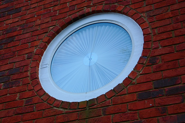
| The lighting of this is very dark, it could use more light. |
|
|
|
03/31/2008 09:26:18 AM |
| the lines in this photo define the positive characteristics of this image. |
|
|
|
03/29/2008 01:14:51 PM |
| My only issue is the lighting/shading. This was taken with natural light...thank you, but the time of day has caused a shadow to become reflected in the glass. So, if that was your intent, yeah! But it is not to my liking. |
|
|
|
03/28/2008 02:16:24 AM |
| the trouble with this image is that I am not sure what is the intended pattern! The bricks or the clock face there is too much of both! |
|
|
|
03/27/2008 10:12:11 PM |
| Good deep color on the bricks and strong contrast overall. The comp is kind of plain to me, but you did a great job on adjusting the colors and tones to get some impact out of an ordinary thing. |
|
|
|
03/27/2008 02:22:59 PM |
| Nice picture, but the odd perspective makes it confusing to look at |
|
|
|
03/27/2008 03:50:03 AM |
| It's a good subject but I feel it would have been better if you could have got square onto it rather than looking up at it. |
|
|
|
03/26/2008 11:37:03 AM |
| Interesting shot, it reminds me of whatsisname...Echer? |
|
Home -
Challenges -
Community -
League -
Photos -
Cameras -
Lenses -
Learn -
Help -
Terms of Use -
Privacy -
Top ^
DPChallenge, and website content and design, Copyright © 2001-2025 Challenging Technologies, LLC.
All digital photo copyrights belong to the photographers and may not be used without permission.
Current Server Time: 03/14/2025 09:30:59 AM EDT.