| Author | Thread |
Comments Made During the Challenge  |
|
|
04/01/2008 12:38:31 PM |
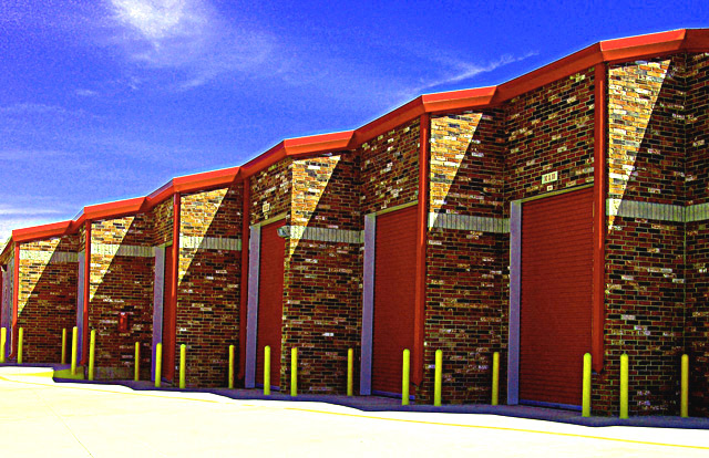
| too much on the levels and the grainy sky is bad |
|
|
|
03/31/2008 07:16:33 PM |
| I like this picture a lot. Everything about it, from the composition, color and objects attract me to the picture. Nice job. |
|
|
|
03/31/2008 09:39:59 AM |
| The colors pop out in this photo. |
|
|
|
03/31/2008 03:56:41 AM |
| while I really like the concept and compostion, I think this image greatly suffers from the processing. i.e. over saturation and a lot of noise in the skies. |
|
|
|
03/30/2008 08:59:16 PM |
| overprocessed. too much color noise introduced. |
|
|
|
03/30/2008 08:13:27 PM |
| great image. fits the challenge and the colors are nice. 9 |
|
|
|
03/29/2008 12:39:53 PM |
| Repetitve pattern, nice. Colors, nice. Something interesting to look at, nice. Editting, not so nice, imo. |
|
|
|
03/28/2008 11:27:57 AM |
| nice take on storage bays, like the comp and lines. 7 |
|
|
|
03/27/2008 09:22:21 PM |
| I like the framing here and the shadows really add a little something extra. Nice vivid color combinations too. The only thing I would change is the exposure. The concrete is pretty blown out. A levels adjustment in your favorite editing program could fix it right up. |
|
 Photographer found comment helpful. Photographer found comment helpful. |
|
|
03/27/2008 04:16:31 PM |
| A nice pattern and super bright, but I think you may have over processed slightly.... |
|
| Photographer found comment helpful. |
|
|
03/27/2008 10:06:52 AM |
| This looks way too saturated but i guess you were going for high contrast in the colors, it looks too noisy also |
|
| Photographer found comment helpful. |
|
|
03/26/2008 05:38:08 PM |
| Makes a great abstract with vibrant colors. Great composition, too. |
|
| Photographer found comment helpful. |
|
|
03/26/2008 09:43:57 AM |
| it looks a little out of focus. |
|
| Photographer found comment helpful. |
|
|
03/26/2008 09:37:34 AM |
|
| Photographer found comment helpful. |
|
|
03/26/2008 08:08:56 AM |
| Wish you had rotated the image slightly to the left or adjusted the perspective a little to get the verticals perfectly at 90degrees 6 |
|
| Photographer found comment helpful. |
|
|
03/26/2008 05:30:32 AM |
| I'm seeing artifacts on the sky. Other than that, nice pattern. |
|
| Photographer found comment helpful. |
Home -
Challenges -
Community -
League -
Photos -
Cameras -
Lenses -
Learn -
Help -
Terms of Use -
Privacy -
Top ^
DPChallenge, and website content and design, Copyright © 2001-2025 Challenging Technologies, LLC.
All digital photo copyrights belong to the photographers and may not be used without permission.
Current Server Time: 03/12/2025 10:04:33 AM EDT.