| Author | Thread |
|
|
10/07/2002 02:47:00 PM |
| Should have gotten a higher score, in my poinion! :) So lush! |
|
Comments Made During the Challenge  |
|
|
10/06/2002 05:27:00 PM |
| Very "seasonal" look -- nice colors... |
|
|
|
10/06/2002 11:26:00 AM |
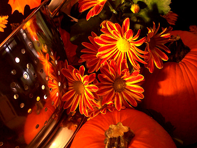
| The brilliancy of the colors here make this shot exquisite. I like the addition of the colander as the reflective surface. It seems appropriate in an sutumn kitchen scene. great job. 8, just-married |
|
|
|
10/06/2002 09:15:00 AM |
| Beautiful colours.9-Martin |
|
|
|
10/04/2002 11:11:00 PM |
| Your picture is good, but it lacks drama. |
|
|
|
10/02/2002 08:13:00 PM |
| Wonderfull still life. The colors are fantastic! |
|
|
|
10/02/2002 03:05:00 PM |
|
|
|
10/02/2002 12:46:00 PM |
| Nice composition, I like all the fall colors. 9 smshats |
|
|
|
10/01/2002 10:03:00 PM |
| Awesome colors, but the reflection LOOKS LIKE an afterthought. I understand it may not be, but that's the impression. 8 nards656 |
|
|
|
10/01/2002 10:22:00 AM |
| This is a fantastic shot so don't take this the wrong way. I don't think the reflection is strong enough� The colours in this shot is sublime, the composition can't be faulted, it's beautiful, the symmetry is relaxing and this would look just fantastic hanging on an unadorned cream coloured wall. BUT, the colander just doesn't work in the challenge context; but this is just so good a shot I feel like a pedantic old fuddy-duddy for saying so� But there is a reflection there� (9) Great shot� and I really wanted to score this 10� |
|
|
|
10/01/2002 07:48:00 AM |
| I like the lighting here and the color choice. I don't totally understand the subject matter though. |
|
|
|
10/01/2002 06:50:00 AM |
this is one of my favorite subject categories at this time of the year.......
Pumpkin Art |
|
|
|
10/01/2002 02:40:00 AM |
| A very pleasant scene with lovely color. Not so strong on the reflection subject. |
|
|
|
10/01/2002 12:14:00 AM |
|
|
|
09/30/2002 06:43:00 PM |
| Nica colours!! but I don't see much of the reflection. |
|
|
|
09/30/2002 04:31:00 PM |
| Nice job.IMHO the color/light is a tad bit strong for my taste. :) Score 6 Justine |
|
|
|
09/30/2002 12:53:00 PM |
| Great colors and interesting lighting too. The composition is a little bit jerkily for my taste. Perhaps a closer cut out would be helpful? voted 7 - nds |
|
|
|
09/30/2002 07:28:00 AM |
| great colors! I like the orange/yellow mix... |
|
|
|
09/30/2002 01:20:00 AM |
| What awesome autumn colors !!! Well done ! = 9 Shiiizzzam |
|
|
|
09/30/2002 12:43:00 AM |
| Wow... nice job! You've definitely met the challenge here, and in a unique manner. I love the colors in the photo... they work very well together... To be nitpicky? The shadows are a bit distracting, and a little spot on the counter is overexposed? You've done a great job with this shot! - 9 - JB |
|
Home -
Challenges -
Community -
League -
Photos -
Cameras -
Lenses -
Learn -
Help -
Terms of Use -
Privacy -
Top ^
DPChallenge, and website content and design, Copyright © 2001-2025 Challenging Technologies, LLC.
All digital photo copyrights belong to the photographers and may not be used without permission.
Current Server Time: 12/14/2025 02:06:37 PM EST.