| Author | Thread |
Comments Made During the Challenge  |
|
|
10/13/2002 09:16:00 PM |
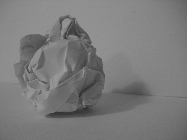
| A little too gray. A white-on-white may have worked better. |
|
|
|
10/13/2002 03:12:00 PM |
| A little dark for a photo that appears to be mostly white. Try some contrast. |
|
|
|
10/13/2002 11:50:00 AM |
| Not sure why the black and white here. It kind of makes the photo look a little darker than it should. Your angle is nice and I like the framing/cropping. Focus seems ok. Overall an average shot. Good luck in the challenge. ~hbunch7187~ |
|
|
|
10/13/2002 11:15:00 AM |
Composition: Subject Placement, Cropping, Background7,
Technical: Focus, Exposure, Lighting, Processing6,
Appeal: Is it Interesting, Motivating, Etc.? 2,
Total Averaged Rating5. Autool
|
|
|
|
10/12/2002 12:59:00 AM |
| Nie try. Poor lighting. Nice framing. uninteresting subject. 4/10 for the effort. |
|
|
|
10/10/2002 11:06:00 AM |
| Little more light would help bring out the shadows. Good composition (6) MarkRob |
|
|
|
10/10/2002 02:00:00 AM |
| At first I thought it needed more contrast, but the faded grey look grew on me quickly. 9 |
|
|
|
10/09/2002 12:54:00 PM |
| The concept and composition on this photo are both good... The lighting is a bit weak, however. - setzler |
|
|
|
10/08/2002 09:16:00 PM |
|
|
|
10/08/2002 02:04:00 PM |
| simple and good, seven for you. |
|
|
|
10/07/2002 11:01:00 PM |
| might look better with more contrast? |
|
|
|
10/07/2002 10:52:00 PM |
| It might have been better to have a darker background. It all blends in too much IMO. |
|
|
|
10/07/2002 09:19:00 PM |
| This photo doesn't show much of anything interisting. It's a bit on the dark side as well...sorry :( 3 |
|
|
|
10/07/2002 01:29:00 PM |
| Under-exposed. Needs levels adjusted. (5) |
|
|
|
10/07/2002 12:44:00 PM |
| Good idea, but would be better if it was more "white". A bit dark for my taste. |
|
|
|
10/07/2002 11:04:00 AM |
| contrast isn't quite upto scratch.. image doesn't really grab me.. 4 |
|
|
|
10/07/2002 09:36:00 AM |
| I think this shot could have been very effective with a little more light. Then there would have been good contrast between the white and the shadow. But everything just sort of looks gray as it is. |
|
|
|
10/07/2002 08:42:00 AM |
Technically correct , exposure, focus, saturation , contrast. 5 very soft sorry if that is intentional
Good composition. 6
Tells a story or creates a mood 5
Impact to the viewer 5
Relevance to the Challenge 6
Overall 5
sulamk
|
|
|
|
10/07/2002 02:44:00 AM |
|
|
|
10/07/2002 01:14:00 AM |
| I really like this simple concept, but it needs to be brighter, so it actually is white... it's too dull this way. |
|
Home -
Challenges -
Community -
League -
Photos -
Cameras -
Lenses -
Learn -
Help -
Terms of Use -
Privacy -
Top ^
DPChallenge, and website content and design, Copyright © 2001-2025 Challenging Technologies, LLC.
All digital photo copyrights belong to the photographers and may not be used without permission.
Current Server Time: 03/12/2025 02:28:21 PM EDT.