| Author | Thread |
Comments Made During the Challenge  |
|
|
10/13/2002 09:17:00 PM |
| Good idea, but solitude is somehow not achieved. |
|
|
|
10/13/2002 11:09:00 AM |
Composition: Subject Placement, Cropping, Background9,
Technical: Focus, Exposure, Lighting, Processing8,
Appeal: Is it Interesting, Motivating, Etc.? 7,
Total Averaged Rating8. Autool
|
|
|
|
10/11/2002 07:10:00 AM |
| Superb photography� Composition is first class and the colours all compliment each other to perfection�. (10) |
|
|
|
10/11/2002 05:31:00 AM |
| who's got a pants aim?????? hehe, good job |
|
|
|
10/10/2002 12:44:00 PM |
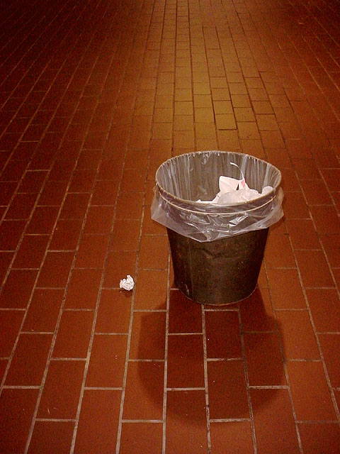
Its a good photo but I find the way the shadow goes DOWN the photo a bit strange looking. Maybe you could make it go UP the photo, following the lines created by the tiled floor.
I've just had a though, You could try rotating this so it looks like the bin and paper and stuck to a brick wall. That might looks quite cool :)
- Konador |
|
|
|
10/09/2002 09:50:00 AM |
| use a little more imagination |
|
|
|
10/08/2002 11:54:00 PM |
| Tecnically fine, the terra cotta coloring saves the picture wich otherwise woudn't be very attractive. Good choice! Grayce 6 |
|
|
|
10/08/2002 09:23:00 PM |
| VERY NICE. LOT'S OF EMOTION... ALMOST ANXIETY BUT IN A GOOD WAY. REALLY LIKE THE COLOR, CONTRAST, AND FORMS. |
|
|
|
10/08/2002 06:23:00 PM |
| oops. missed one :) Nice negative space. 7 |
|
|
|
10/08/2002 06:08:00 PM |
Nice. Good lighting.
I would have lost the placcy bag & put a bigger ball of paper on the floor but what the hey... it's good. |
|
|
|
10/08/2002 05:31:00 PM |
| I love this one... this would have worked great for the negative space challenge as well... nice use of the vertical arrangement. (8) MarkRob |
|
|
|
10/08/2002 02:44:00 PM |
|
|
|
10/08/2002 12:49:00 AM |
| Composition and lighting are good. Effective. Looks thought out and planned. |
|
|
|
10/07/2002 09:44:00 PM |
|
|
|
10/07/2002 05:37:00 PM |
7Overall
8Challenge Met
8Color (tints, casts, bleeds)
6Exposure, Lighting (Shadows, reflections)
7Focus & Clarity
9Framing, Subject Placement, Background
8Visual Appeal, Subject matter
7Would I frame or poster-board this picture?
|
|
|
|
10/07/2002 03:18:00 PM |
| Great composition. I like the perspective of the bricks and the disruption of the missed trash. |
|
|
|
10/07/2002 11:26:00 AM |
| good composition and lighting. |
|
|
|
10/07/2002 02:06:00 AM |
| Simple idea, but nicely done. |
|
Home -
Challenges -
Community -
League -
Photos -
Cameras -
Lenses -
Learn -
Help -
Terms of Use -
Privacy -
Top ^
DPChallenge, and website content and design, Copyright © 2001-2025 Challenging Technologies, LLC.
All digital photo copyrights belong to the photographers and may not be used without permission.
Current Server Time: 04/27/2025 02:52:24 AM EDT.