| Author | Thread |
Comments Made During the Challenge  |
|
|
10/13/2002 11:22:00 AM |
Composition: Subject Placement, Cropping, Background5,
Technical: Focus, Exposure, Lighting, Processing5,
Appeal: Is it Interesting, Motivating, Etc.? 3,
Total Averaged Rating4. Autool
|
|
|
|
10/13/2002 01:20:00 AM |
|
|
|
10/12/2002 11:28:00 AM |
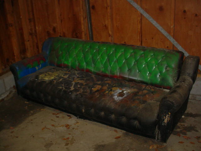
| poor lighting, composition, and focus. |
|
|
|
10/12/2002 01:13:00 AM |
|
|
|
10/11/2002 07:36:00 AM |
| Maybe once upon a time. lol. This one has definately had it. I like the angle and framing/cropping here, but I think the focus is a bit soft for me. maybe if there were a bit more lighting, then the "details" of the couch might come out a bit more. Overall a nice shot though. Definately garbage related. Good luck in the challenge. ~Hbunch7187~ |
|
|
|
10/10/2002 07:59:00 PM |
|
|
|
10/09/2002 09:47:00 AM |
| The image (subject) itself is OK, however it needs a more refined focus. |
|
|
|
10/09/2002 05:41:00 AM |
| Wow, how much did you pay? |
|
|
|
10/08/2002 06:59:00 PM |
| lighting is too poor...nice green and blue |
|
|
|
10/08/2002 06:00:00 PM |
| not a good shot and not a clever caption |
|
|
|
10/08/2002 05:36:00 PM |
| You need to overexpose this shot to get more detail in it. I think it would have been neat to take a more graphic, abstract of this couch, like along the line where new(?) green leather meets whatever the other material is for the cushions. (3) MarkRob |
|
|
|
10/08/2002 05:22:00 AM |
| Wow, that sure is ugly... don't think I'd like to sit on that. There is not enough contrast between it and the wall/floor... doesn't really stand out. Could be a little brighter. |
|
|
|
10/07/2002 05:43:00 PM |
5Overall
9Challenge Met
5Color (tints, casts, bleeds)
5Exposure, Lighting (Shadows, reflections)
5Focus & Clarity
6Framing, Subject Placement, Background
5Visual Appeal, Subject matter
6Would I frame or poster-board this picture?
|
|
|
|
10/07/2002 04:10:00 PM |
| A longer exposure would have ensured a wonderful shot here. |
|
|
|
10/07/2002 02:01:00 PM |
|
|
|
10/07/2002 09:33:00 AM |
| How on earth can it be so many different colors?!? A bit on the dark side as it is tough to see. Good composition though. DPz |
|
|
|
10/07/2002 08:23:00 AM |
| Good idea. I woud like to see this a little lighter and more in focus. |
|
Home -
Challenges -
Community -
League -
Photos -
Cameras -
Lenses -
Learn -
Help -
Terms of Use -
Privacy -
Top ^
DPChallenge, and website content and design, Copyright © 2001-2025 Challenging Technologies, LLC.
All digital photo copyrights belong to the photographers and may not be used without permission.
Current Server Time: 03/12/2025 01:56:12 AM EDT.