| Author | Thread |
Comments Made During the Challenge  |
|
|
10/13/2002 08:58:00 PM |
| Ok for a simple still life to meet the theme. |
|
|
|
10/13/2002 10:58:00 AM |
Composition: Subject Placement, Cropping, Background6,
Technical: Focus, Exposure, Lighting, Processing7,
Appeal: Is it Interesting, Motivating, Etc.? 3,
Total Averaged Rating5. Autool
|
|
|
|
10/11/2002 05:41:00 AM |
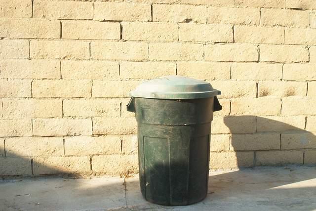
| Without the foreground shadows and the can a bit more to the right, this would've been a lot higher on my list. |
|
|
|
10/11/2002 05:32:00 AM |
| so it is, but still a nice photo:-) mysterious. |
|
|
|
10/10/2002 04:58:00 PM |
| This photo seems a little too simple... not sure if I like the low and off centered subject either. - bamaster (6) |
|
|
|
10/09/2002 06:21:00 PM |
| the shadows Hurt the cause & Appearance |
|
|
|
10/09/2002 01:20:00 AM |
Technically correct , exposure, focus, saturation , contrast. 5
Good composition. 4
Tells a story or creates a mood 4
Impact to the viewer 4
Relevance to the Challenge6
Overall 5
sulamk
|
|
|
|
10/08/2002 07:11:00 PM |
| Yes it is. It is a trash can, and nothing more. I think this lacks something to make it exciting to me. The wall seems too bright in the sun, and the shadow is distracting. The top of the can is washed out. The anlge and framing/cropping are good, and the focus on the can is also nice. I like the use of neg. space, but kind of wish it were more interesting neg. space. Good luck in the challenge. ~Hbunch7187~ |
|
|
|
10/07/2002 09:23:00 PM |
| Overall I like this simplistic idea a lot. Had it been me, I may have tried moving the can further to the left to allow the full shadow in the shot, and eliminate the small diagonal shadow from the left. Again, still a very good idea. |
|
|
|
10/07/2002 05:37:00 PM |
| Your title says it all - but composition and lighting are poor |
|
|
|
10/07/2002 11:52:00 AM |
| Yup... it's a trashcan... The photo doesn't say much else :) - setzler |
|
|
|
10/07/2002 10:38:00 AM |
| Move it to the left and get it's whole shadow |
|
|
|
10/07/2002 06:40:00 AM |
| I really like the brick wall and the sunlight. I think this shot begs to have the can more off center though. Look at the shot in this challenge R2D2 and how the can off by itself came out so nice. Good job. DPz |
|
Home -
Challenges -
Community -
League -
Photos -
Cameras -
Lenses -
Learn -
Help -
Terms of Use -
Privacy -
Top ^
DPChallenge, and website content and design, Copyright © 2001-2025 Challenging Technologies, LLC.
All digital photo copyrights belong to the photographers and may not be used without permission.
Current Server Time: 03/12/2025 04:56:32 PM EDT.