| Author | Thread |
|
|
06/27/2008 05:34:11 PM |
Critique Club Review:
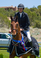
Interesting image... I try not to get too involved with the message of the piece, unless the photographer's comments allude to what they were trying to say. Mainly because many people recieve messages the photographer never sent. In this case though, the image begs to be interpreted because there is little else. So I'm going to guess that the message was that the image doesn't matter, winning does. Am I right?
Yes the white of the "image" is blown out. However, I personally think that it adds to the piece here. It ensures that there is no detail and the "portrait" is empty and featureless.
Focus also seems a bit shallow. The top of the frame appears to be starting to go soft. The computer monitor, would have been better turned off. As it is, it distracts the eye. The back wall, or whatever is behind the picture works. I like that texture in this composition. Had you removed all the other distractions, or made them much softer, I think this would have made a stronger statment, and your score would be higher.
I think your score is a bit lower than you deserved. The problem being that this is one of those pictures that you really need to sit and read for a bit. During the voting, people get in a hurry with all the photos to vote on. One of the reasons I like the Critique Club is that I can take time with a single photo and really explore it. Really see it.
So again I say, this is a very interesting image. Not as colorful, not as busy as the others, but very interesting if you spend a bit of time with it. I'd like to see this one done a again.
Nice job... |
|
 Photographer found comment helpful. Photographer found comment helpful. |
Comments Made During the Challenge  |
|
|
06/24/2008 04:02:36 PM |
| Creative! How many comments about �the blown out highlights in the picture frame� did you get? :-D |
|
| Photographer found comment helpful. |
|
|
06/23/2008 05:32:50 PM |
| Funny, but I doubt it will work. Sublty is lost here...even though it's not so sublte. :) |
|
| Photographer found comment helpful. |
|
|
06/21/2008 08:01:01 AM |
| Great conceptual shot- really hits the challenge perfectly. |
|
| Photographer found comment helpful. |
|
|
06/21/2008 07:38:03 AM |
| Great idea. Very unique! 8 |
|
| Photographer found comment helpful. |
|
|
06/20/2008 05:31:16 PM |
If it was that simple ;) Sorry, but I don't get the message. Is the background significant? Why an empty frame? Is there some deep philosophical statement implied?
I'm trying to imagine what the effect would be, had you printed your picture and put that one in the frame, then reshot, etc. etc. (but with the ribbon only in the last frame...). Estethically not entirely without charm, food for thought, but a bit too deep for me. |
|
| Photographer found comment helpful. |
|
|
06/20/2008 02:54:20 PM |
I gave this a 10...great idea...and we all really view this as success...otherwise we wouldn't entre challenges.
good job |
|
| Photographer found comment helpful. |
|
|
06/18/2008 07:13:40 PM |
| Great B&W pic, the ribbon should have six sides to the top circle and the blue should be a little lighter in color and if you had a big bum or something funny in the pic frame I would have given you a 10. good luck |
|
| Photographer found comment helpful. |
|
|
06/18/2008 01:56:17 PM |
hmmm, a plain white photo would never have got the blue...might be one of  charliebaker's shots ;-) charliebaker's shots ;-) |
|
| Photographer found comment helpful. |
|
|
06/18/2008 02:28:22 AM |
|
| Photographer found comment helpful. |
|
|
06/18/2008 01:37:15 AM |
|
| Photographer found comment helpful. |
|
|
06/18/2008 12:59:54 AM |
|
| Photographer found comment helpful. |
Home -
Challenges -
Community -
League -
Photos -
Cameras -
Lenses -
Learn -
Help -
Terms of Use -
Privacy -
Top ^
DPChallenge, and website content and design, Copyright © 2001-2025 Challenging Technologies, LLC.
All digital photo copyrights belong to the photographers and may not be used without permission.
Current Server Time: 03/11/2025 01:43:17 PM EDT.