Critique Club Review:
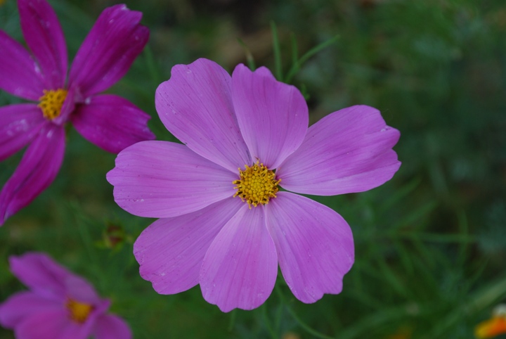
Color, Saturation, and Hue: Colors appear accurate, saturation is not overdone, and hue is appropriate.
Brightness and contrast: The brightness is a little low on this image, which makes the colors look a little bit cool. A little brighter would help the colors of the flower pop.
Focus and depth of field: Focus is good, depth of field could be made more shallow with a larger aperature, to help eliminate competion for the subject.
The grass is still distinct enough to make the background look busy and distract the eye. The flowers at the left, with their deep purple hues, are still distinct enough to compete. Their softness also tends to trick the eye into thinking that the subject is a little bit soft was well.
I would suggest that next time, try not to center the subject quite as much, and either move the other flowers out of the way or include them in the focus zone. |