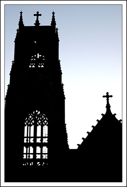
Church of St. Ita on Catalpa and Broadway, Edgewater District, Chicago, IL
When the Church of Saint Ita was built back in 1927, no expense was spared. The finest materials were imported and the most talented artisans were hired to create the building, called "an Edgewater gem."
Tech: perspective was corrected a little bit, increased contrast, unsharp mask 25/2/1 and resize.
Statistics
Place: 107 out of 169 Avg (all users): 5.1856 Avg (commenters): 6.7500 Avg (participants): 5.2524 Avg (non-participants): 5.1099 Views since voting: 969 Votes: 194 Comments: 5 Favorites: 0
In this image, I see a very strongly presented sillhouette. With almost no gradients in terms of shadow, it appears formidable and bulky, except that the windows allow for some delicacy. So it already has some tensiveness (delicacy vs. bulk) which I like. I also really enjoy the gradient of the sky as it goes from the blue to the lighter color as it goes down to the bottom of the frame. The image is well composed and well balanced, and seems to agree with itself in terms of style and communication.
At first, I thought the image may have been tilted to the right, but now it appears that it is merely skewed and you get the keystone effect of looking up. Without the right half having any tower, though, it gives the illusion of not being vertical. One suggestion may be to use some kind of Skew tool to straighten the whole affair, or to get even closer so the skew is more obvious. You'd also get a stronger appearance of height with this latter choice, if that is important to you.
It may be a tad oversharpened. Your unsharp mask levels were 25/2/1. Try a smaller pixel radius and end up with numbers like 500/0.2/0, just to experiment, and you won't get so wide a halo. You'll also preserve more details. Make sure you sharpen after you resize for the web, if you don't do that already.
All in all, the photo emphasizes the gothic architecture of this cathedral, which is interesting in and of itself, and the gentle light adds a very nice touch. One thing you may want to think about is how you want me as a viewer to feel. Do you want to evoke a certain mood or feeling? Should I feel relaxed at this photo? On edge? Afraid? Happy? Nostalgic? My main suggestion would be to make sure that the feeling you want to communicate is clear, vivid, and enthusiastic.
Hey, great work. I like your other work, too. Keep it up!