Lovely composition and concept, Rosemary, but I do agree with Peter and Deb about needing a greater sense of depth. And you're far from being the only one capable of tanking in terms of scores.
And hey, as Deb referenced the mighty ribbon-winning machine, IreneM...guess what? Even she has a recent score in the 4s!
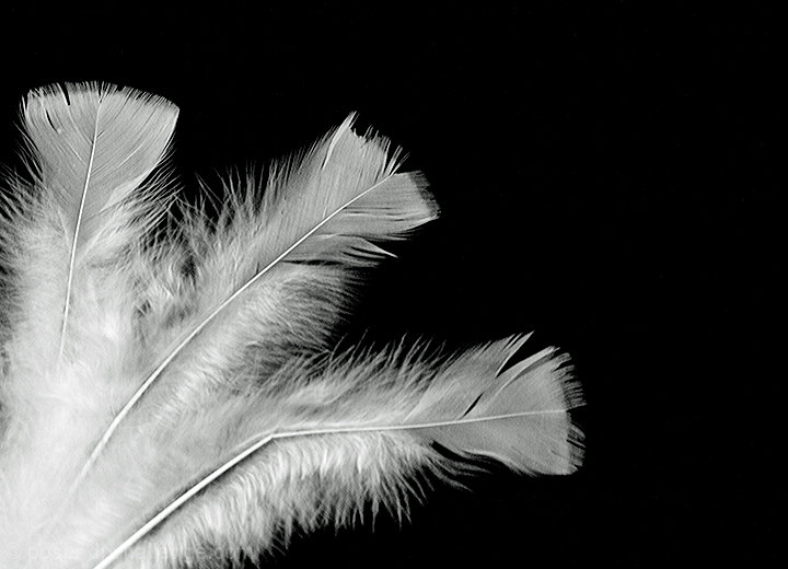
Couldn't say much Deb hasn't said. The black/white thing is great, but somehow doesn't 'pop' as they say. Sense of depth would be good. Some sort of angled light to create texture in the feathers. Some sort of awfully clever thing, concealed by the feathers themselves, but holding them up and away from the background... Not sure if I know what I'm talking about there, what with the background being effectively invisible. That sort of in-focus-foreground against out-of-focus-background really brings out the edges of things. 2 stationary and one with blurred movement? (For the falling thing).
As far as votes are concerned, it looks like physical won out over figurative... Don't think too much about the target audience though, it's like no one matured beyond shiny bubble gum wrappers and that's not an uplifting point for meditation. Keep firing off shots and watching the effect.
First, the good stuff - as your one commenter remarked, it's a simple and strong composition - I can see this working very well (and it has in the past) with tulips, too. And you used three - odd numbers are always good, or so my grandmother taught me. Lighting is OK, but doesn't really add shape to your subject. Evenly lit is good, but shaping light is better, and I haven't a lot to suggest as how to get that from artificial light. Try lighting from the side with something to reflect that light on the other side - white posterboard is a good bet for reflecting light, or just white paper for small subjects. What probably hurt the score the most is lack of tack sharp focus. There isn't an area that to me appears perfectly focused. In shooting pure white on pure black, quite often you'll have to manually focus because the camera can't figure what it is you want. As shot from above, with pure white on pure black, there's no depth to the shot. One of the things I notice in the top scoring shots (but not in my own, so I lack this, too) is the ability to create and portray depth. With this subject, you could try shooting more at an angle rather than straight overhead, to use depth of field and let the feathers in the back blur out a bit. You'd still need the front feather tack sharp, though. Finally, a personal preference of mine is to have some texture to a background, whether that be gradations in color or light, or actual texture. I notice in most of IreneM's work that while the background is very simple, there is some gradation to it, again contributing to the sense of depth.