| Author | Thread |
|
|
04/26/2004 01:12:20 AM |
| You got another 10 from me. I've given you an average of 7.25 for 8 of your photos. I knew I added you to my favorites for a reason. Great work as usual! |
|
 Photographer found comment helpful. Photographer found comment helpful. |
Comments Made During the Challenge  |
|
|
04/25/2004 10:50:45 PM |
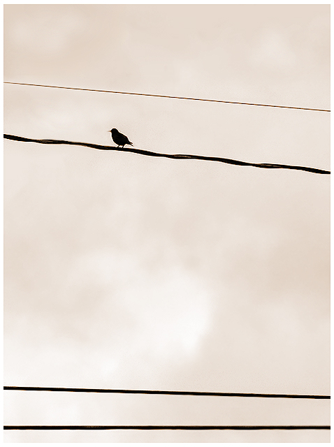
| Great simple composition makes this shot very interesting. The great background of the sky really helps to make the silhouette of the bird stand out. One thing that IMHO may make it even better is cropping out the bottom power/telephone line. It would give a better balance. |
|
| Photographer found comment helpful. |
|
|
04/25/2004 10:21:44 PM |
| My only 10 of the challenge. Silhouettes can be used so effectively in conjunction with a minimalist composition and you've really played that to your advantage. The wires are placed perfectly in the frame to keep balance and the bird's silhouette is very sharp and perfectly sideways. This is a really great shot! |
|
| Photographer found comment helpful. |
|
|
04/25/2004 09:06:57 PM |
| Maybe a little over-sharp, with noticable halos; might work a bit better if the bird was over to the right a bit. |
|
| Photographer found comment helpful. |
|
|
04/24/2004 08:33:44 PM |
| Good concept but I would liked to have seen more background. |
|
| Photographer found comment helpful. |
|
|
04/24/2004 08:13:51 AM |
| I like your idea, your silouette, and your placement. I would very much prefer that you had removed the other three electric lines. I don't think that they help you at all. Thanks for sharing. |
|
| Photographer found comment helpful. |
|
|
04/23/2004 08:43:14 PM |
| how I would have loved to see this without the bottom 2 wires.. great job non the less. |
|
| Photographer found comment helpful. |
|
|
04/22/2004 02:45:27 AM |
| The lower lines pull my attention from the subject; croping just above them allows my attention to remain focussed. I like the tones a lot. |
|
| Photographer found comment helpful. |
|
|
04/21/2004 10:45:15 PM |
| Nice bird silhouette. I think the bottom two wires could have been cropped off and the picture would have been more effective. The color scheme is nice. |
|
| Photographer found comment helpful. |
|
|
04/21/2004 05:59:05 PM |
|
| Photographer found comment helpful. |
|
|
04/21/2004 07:38:55 AM |
|
| Photographer found comment helpful. |
|
|
04/21/2004 01:07:36 AM |
IMHO the bottom lines are not needed elements and detract from the true subject of the shot. Without them you have a much cleaner and more impactful composition!
TC |
|
| Photographer found comment helpful. |
|
|
04/19/2004 08:05:52 PM |
| Meets the challenge but subject is so small, or there's too much negative space, so in the end it doesn't work for me. For me, mind you. |
|
| Photographer found comment helpful. |
|
|
04/19/2004 03:52:28 PM |
| Nice idea - I like the sepia effect. Compsitionally, I think your image is just the top half of the frame. Title perfect. |
|
| Photographer found comment helpful. |
|
|
04/19/2004 03:38:50 PM |
| Shoulda cropped out those wires at the bottom. Really distracting. |
|
| Photographer found comment helpful. |
|
|
04/19/2004 01:53:06 PM |
| Way too much sharpening for my tastes. Then the subject is very small. |
|
| Photographer found comment helpful. |
|
|
04/19/2004 12:01:11 PM |
| I don't think the border compliments the shot (perhaps a thin, dark one??) Composition is interesting - I like the use of parellel lines and negaive space. Overall a bit static. |
|
| Photographer found comment helpful. |