| Author | Thread |
Comments Made During the Challenge  |
|
|
10/20/2002 10:56:00 PM |
|
|
|
10/20/2002 02:23:00 PM |
|
|
|
10/20/2002 12:59:00 AM |
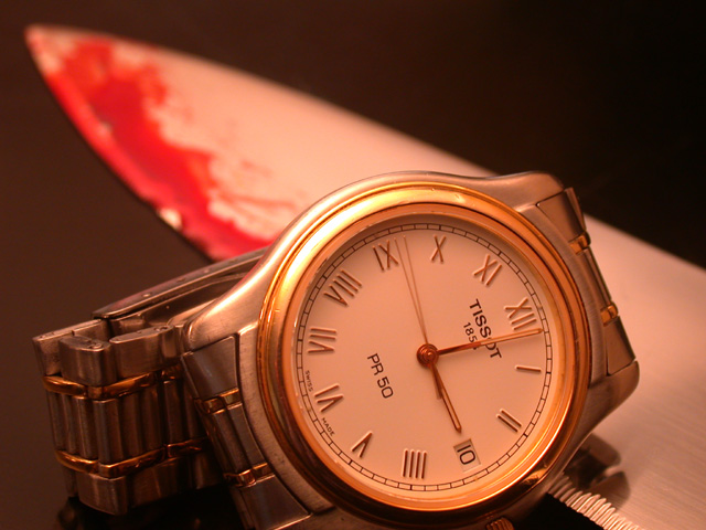
| Realistic enough. Look for the second hand to move. I like. Hard to critique though. Clear watch, soft color and lighting adds to, would have liked a little more sharpness of knife - if possible. Over fairly good shot. |
|
|
|
10/19/2002 09:53:00 AM |
Composition: Subject Placement, Cropping, Background7,
Technical: Focus, Exposure, Lighting, Processing9,
Appeal: Is it Interesting, Motivating, Etc.? 3,
Total Averaged Rating6. Autool
|
|
|
|
10/18/2002 01:10:00 PM |
| More focus on the bloody blade would have been nice. Good concept. |
|
|
|
10/17/2002 04:34:00 PM |
|
|
|
10/17/2002 11:50:00 AM |
| to kill time? ...bloody time. Nice photo |
|
|
|
10/16/2002 11:58:00 PM |
| great composition, meats the challenge, lighting is a tad 'strange', ....I like it |
|
|
|
10/16/2002 04:52:00 PM |
| Like the color on this and the soft background for a harsh subject |
|
|
|
10/16/2002 03:57:00 PM |
| Very neat, clarity is magnificent. I've been trying to think if the time 3:02 mean't anything, but I'm not coming up with anything. It's been a long time since I've read the book, "A Time To Kill", so I can't remember if there is a significance. The only thing about this shot is that it just seems TOO clean and neat. Killing is messy especially with a knife...maybe there should be more blood, but that's beside the point. Congrads on a nice shot. |
|
|
|
10/15/2002 10:12:00 PM |
| Excellent quality on the watch, except for a slight glare that PS possibly could have eliminated. Great color, obvious slow exposure (based on the second hand). If it weren't for your title, though, I wouldn't connect it to the challenge very well. 8 nards656 |
|
|
|
10/15/2002 03:34:00 PM |
| great, another TV ad. score...u actually want one..ok...1! |
|
|
|
10/15/2002 12:31:00 PM |
| Composition: Subject Placement, Cropping, Background 7 , Technical: Focus, Exposure, Lighting, Processing 5 , Appeal: Is it Interesting, Motivating, Etc.? 5 , Total Averaged Rating 6 . smshats |
|
|
|
10/15/2002 07:33:00 AM |
| Great! I think if the watch had been set to midnight could have been better. |
|
|
|
10/14/2002 10:08:00 PM |
|
|
|
10/14/2002 09:31:00 PM |
| Nice shot. I think the gradient color across the background works quite well. The limited dof seems to work well in this shot. I would like to see what it would look like with a deep dof though, just for kicks :) Good job! - JB |
|
|
|
10/14/2002 08:57:00 PM |
| Interesting idea and I like the clarity of the watch |
|
|
|
10/14/2002 07:33:00 PM |
| Wonderful creativity and framing. Good use of you DOF. |
|
|
|
10/14/2002 06:48:00 PM |
| Interesting colors. Interesting use of the closeup. Framing is ok but I feel it is missing something. 7/10 |
|
|
|
10/14/2002 06:19:00 PM |
| Very nice. Very clear message. Focus on the watch is perfect as is the lack of focus on the knife. There is enough clarity throughout the photo to get the point, yet still a "in the background" kind of way. Lighting is nice. Was there a reason for the long exposure with the second hand? Something relevant to that specific time that I am missing? It doesn't really matter, doesn't affect my score or anything, just curious. Very nice shot. Good luck in the challenge. ~Hbunch7187~ |
|
|
|
10/14/2002 02:35:00 PM |
| The color cast detracts a lot from the shot. |
|
|
|
10/14/2002 04:09:00 AM |
| Love your lighting, and composition. Not crazy for the crop at the bottom...I know size limits. This is good, I admire your creativity, it's a good shot. Justine |
|
Home -
Challenges -
Community -
League -
Photos -
Cameras -
Lenses -
Learn -
Help -
Terms of Use -
Privacy -
Top ^
DPChallenge, and website content and design, Copyright © 2001-2025 Challenging Technologies, LLC.
All digital photo copyrights belong to the photographers and may not be used without permission.
Current Server Time: 12/14/2025 02:04:34 PM EST.