| Author | Thread |
Comments Made During the Challenge  |
|
|
10/20/2002 03:52:00 PM |
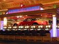
It's a little blown out, but Ii like the cynicism! Notice the little sign, 'Black Market', for that extra touch of biting social commentary!
|
|
 Photographer found comment helpful. Photographer found comment helpful. |
|
|
10/19/2002 01:01:00 PM |
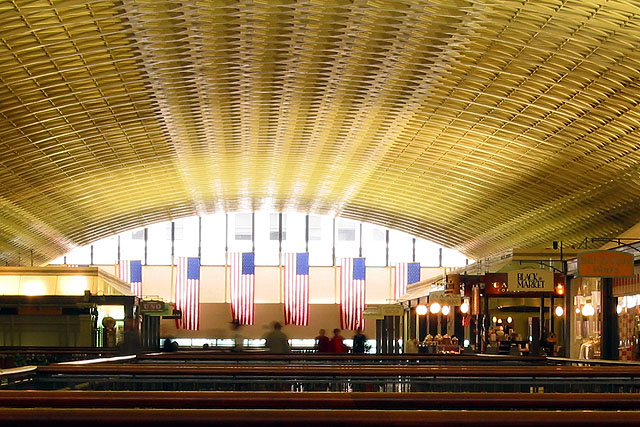
| Union Station is hanging the flags WRONG?!?! |
|
|
|
10/18/2002 07:44:00 PM |
| It does seem like a structure to be proud of, but not to the sin extent, know what I mean? The ceiling sure has some interesting patterns going on. I like the blurred motion people, too. 7 Swash |
|
| Photographer found comment helpful. |
|
|
10/18/2002 09:19:00 AM |
Composition: Subject Placement, Cropping, Background9,
Technical: Focus, Exposure, Lighting, Processing7,
Appeal: Is it Interesting, Motivating, Etc.? 7,
Total Averaged Rating8. Autool
|
|
|
|
10/17/2002 10:35:00 PM |
|
|
|
10/17/2002 09:25:00 PM |
| Could have used better lighting effect |
|
|
|
10/17/2002 05:11:00 PM |
| Composition: Subject Placement, Cropping, Background 7, Technical: Focus, Exposure, Lighting, Processing 6 , Appeal: Is it Interesting, Motivating, Etc.? 5 , Total Averaged Rating 6 . smshats |
|
|
|
10/16/2002 11:33:00 PM |
| Too much glare in the background in an otherwise nice pic. |
|
|
|
10/16/2002 10:09:00 AM |
A nice pic, but I don't see much of a connection with pride. Maybe if there was also a janitor sweeping a spotless floor... but this is really depicting a type of 'celebratory' pride, rather than a 'sinful' one - which is what the contest is all about. 4/10
|
|
|
|
10/16/2002 12:16:00 AM |
| Looks like a wicker basket. |
|
|
|
10/15/2002 07:29:00 PM |
| I actually think this one would have been better if centered. I guess you really can't control those blurry moving people either:) good luck |
|
|
|
10/15/2002 03:36:00 PM |
| could be better if your composition consisted of only a few of the wooden lower part, zoomed in closer to the flags and used a polariser as an anti-glare...try it again, you'll see. score- |
|
| Photographer found comment helpful. |
|
|
10/14/2002 10:23:00 PM |
cant think of this as sin
|
|
|
|
10/14/2002 09:06:00 PM |
|
|
|
10/14/2002 07:39:00 PM |
| I do not think that this is the same kind of pride that the sins are talking about. |
|
|
|
10/14/2002 07:30:00 PM |
| To me this conveys pride in a positive way, rather than as the sin the challenge intended. |
|
|
|
10/14/2002 07:02:00 PM |
| Fantastic use of the ceiling. GREAT repetition. I don't quite understand its relation with the current theme... BUT, very nice shot. 7/10 |
|
|
|
10/14/2002 05:19:00 PM |
| Seems very over-exposed. I think that concentrating on the central area, rather than including the shop fronts would have made for a better composition. |
|
|
|
10/14/2002 01:48:00 PM |
| The perspective is great. Was the exposure longer to allow for the light? I find the movement of the people distracting, but I understand why it's there. |
|
| Photographer found comment helpful. |
|
|
10/14/2002 11:50:00 AM |
| I like this one. Patriotism way overdone |
|
|
|
10/14/2002 09:53:00 AM |
| Great exposure and warm colour. |
|
|
|
10/14/2002 06:28:00 AM |
| The whole shot just seems to draw your eyes right to the flags. Nice shot. lhall |
|
|
|
10/14/2002 04:19:00 AM |
|
|
|
10/14/2002 01:02:00 AM |
| Nicely done. I really like how you did this shot:) Shiiizzzam |
|
Home -
Challenges -
Community -
League -
Photos -
Cameras -
Lenses -
Learn -
Help -
Terms of Use -
Privacy -
Top ^
DPChallenge, and website content and design, Copyright © 2001-2025 Challenging Technologies, LLC.
All digital photo copyrights belong to the photographers and may not be used without permission.
Current Server Time: 03/12/2025 06:43:53 PM EDT.