| Author | Thread |
Comments Made During the Challenge  |
|
|
05/04/2004 08:12:14 AM |
|
 Photographer found comment helpful. Photographer found comment helpful. |
|
|
05/01/2004 06:40:51 PM |
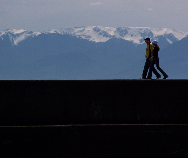
I like much: The expression of proportion. - the simplicity of the picture.
I like less: The white line in the bottom part.
Score: 8
|
|
| Photographer found comment helpful. |
|
|
05/01/2004 09:46:53 AM |
| I think this would look better with most of the black at the bottom cropped off. That would give you a more dynamic horizontal composition. |
|
| Photographer found comment helpful. |
|
|
05/01/2004 03:00:31 AM |
| Nice, maybe trim a little more from the bottom. |
|
| Photographer found comment helpful. |
|
|
04/30/2004 04:30:35 PM |
| Great DOF. Personally I would have cropped it vertically a bit. i.e. lost a bit of black. |
|
| Photographer found comment helpful. |
|
|
04/30/2004 02:35:17 PM |
| There is a lot of dead space at the bottom, a tighter crop would help. |
|
| Photographer found comment helpful. |
|
|
04/28/2004 06:20:06 PM |
| Pretty photo. I'd like to see what it looked like cropped just below their feet. |
|
| Photographer found comment helpful. |
|
|
04/28/2004 11:46:23 AM |
nice shot, but i think would be much better if you cropped out a lot of the bottom.
(rule of thirds) you can see this by scrolling down on your screen until there are maybe an inch or better of the dark section showing. |
|
| Photographer found comment helpful. |
|
|
04/28/2004 11:06:30 AM |
| Lovely. I like everything about this one. Well done. |
|
| Photographer found comment helpful. |
|
|
04/28/2004 10:33:40 AM |
| A very good photo almost a great photo if only the lighting was better. An 8 from me good luck |
|
| Photographer found comment helpful. |
Home -
Challenges -
Community -
League -
Photos -
Cameras -
Lenses -
Learn -
Help -
Terms of Use -
Privacy -
Top ^
DPChallenge, and website content and design, Copyright © 2001-2025 Challenging Technologies, LLC.
All digital photo copyrights belong to the photographers and may not be used without permission.
Current Server Time: 03/13/2025 02:12:11 AM EDT.