| Author | Thread |
Comments Made During the Challenge  |
|
|
05/04/2004 03:10:49 PM |
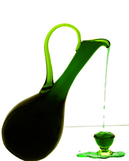
| I wish the bottom of the pitcher was in the photo, It would make a strong composition stronger. There is alot of white in the upper left, either re shoot or crop to match more closely. |
|
 Photographer found comment helpful. Photographer found comment helpful. |
|
|
05/04/2004 01:40:50 AM |
| looks like jello in the cup, the back ground looks very harsh, other than that I like it alot. 7 |
|
| Photographer found comment helpful. |
|
|
05/03/2004 09:06:25 PM |
| This is a really interesting image, well composed, great color choices, and well focused. The line between wall and floor is a little distracting though. |
|
| Photographer found comment helpful. |
|
|
05/03/2004 01:34:41 PM |
| What's that (tilted) horizontal line? |
|
| Photographer found comment helpful. |
|
|
05/03/2004 09:42:14 AM |
| Simple idea, interesting and unique execution. Good colors and I love that the little container is all bubbly. |
|
| Photographer found comment helpful. |
|
|
05/02/2004 02:28:11 PM |
| Good answer to the challenge! Nice colours and composition. |
|
| Photographer found comment helpful. |
|
|
05/02/2004 11:36:24 AM |
| Handsome image, and nice set-up. It's a little too contrasty for my taste. |
|
| Photographer found comment helpful. |
|
|
05/01/2004 04:04:15 PM |
| Nice picture - a 7 from me. Too bad with the grey horizontal line though... |
|
| Photographer found comment helpful. |
|
|
05/01/2004 01:40:04 AM |
| if you went this far setting this up, why not go all the way? this would have been a 10 for me - without the tilted line in the background, the cropping of the bottle, the stains around the cup. I loved the coilours, it illustrates the concept really well 8 |
|
|
|
05/01/2004 01:38:24 AM |
| wow one of my ribbon pics |
|
| Photographer found comment helpful. |
|
|
05/01/2004 12:46:48 AM |
| Nice idea that needs better execution. More back lighting would add to the drama and the horizontal(ish) line in the background (edge of table?) is a bit distracting |
|
| Photographer found comment helpful. |
|
|
04/30/2004 08:01:44 PM |
|
| Photographer found comment helpful. |
|
|
04/30/2004 09:35:40 AM |
| Excellent use of green and a clever setup. Shame the line indicating horizon isn't straight. |
|
| Photographer found comment helpful. |
|
|
04/29/2004 08:21:43 AM |
| cropped too toght on the bottom,background is washed out and out of focus |
|
|
|
04/29/2004 07:31:57 AM |
|
| Photographer found comment helpful. |
|
|
04/29/2004 01:52:01 AM |
| i like this one ... although the grey edge in the background is slightly distracting ... what is this? absinthe? |
|
| Photographer found comment helpful. |
|
|
04/28/2004 10:08:12 PM |
| Great high key shot - well composed and lighted. My only minor complaint is the gray line where the "floor" meets the wall. Great choice of shutter speed. |
|
| Photographer found comment helpful. |
|
|
04/28/2004 02:53:08 PM |
| I like your colors and shapes. Novel idea! |
|
| Photographer found comment helpful. |
|
|
04/28/2004 06:02:24 AM |
|
| Photographer found comment helpful. |
|
|
04/28/2004 02:15:15 AM |
|
| Photographer found comment helpful. |
Home -
Challenges -
Community -
League -
Photos -
Cameras -
Lenses -
Learn -
Help -
Terms of Use -
Privacy -
Top ^
DPChallenge, and website content and design, Copyright © 2001-2025 Challenging Technologies, LLC.
All digital photo copyrights belong to the photographers and may not be used without permission.
Current Server Time: 04/27/2025 03:51:59 AM EDT.