| Author | Thread |
Comments Made During the Challenge  |
|
|
10/20/2008 05:42:25 PM |
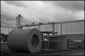
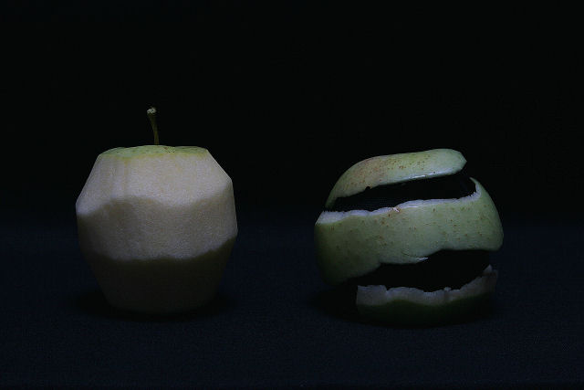
| Good effort but you need to work on lighting. Very under exposed |
|
|
|
10/20/2008 09:51:02 AM |
| woah! thats really cool! but the picture needs a tiny bit more light... |
|
|
|
10/19/2008 10:58:00 PM |
| Good idea but the lighting needs improvement. |
|
|
|
10/18/2008 07:29:29 AM |
| Great concept...needs more light. |
|
|
|
10/18/2008 06:36:47 AM |
| Interesting idea that could have done really well but is crying out for more light! |
|
|
|
10/18/2008 06:34:00 AM |
| The concept in this picture is very good. Only the light is a bit of problem for me. Very well done! |
|
|
|
10/17/2008 02:55:17 PM |
| I like the idea. The colors are not perfect. |
|
|
|
10/16/2008 10:01:33 PM |
| This needs to be a bit brighter, and also perhaps a bit more contrasty. |
|
|
|
10/16/2008 09:28:20 PM |
| Great creative idea. Too dark for my tastes. |
|
|
|
10/16/2008 08:37:12 PM |
| very creative idea, too bad it seems a little dark |
|
|
|
10/16/2008 09:59:24 AM |
| I can't tell barely what it is maybe a bit too dark |
|
|
|
10/16/2008 08:05:38 AM |
| Too dark for my eye, I really like the composition though. 7 |
|
|
|
10/15/2008 10:45:38 PM |
|
|
|
10/15/2008 08:14:16 PM |
| the idea could be for a top photo but the execution is really bad. |
|
|
|
10/15/2008 05:39:20 PM |
| The idea here is a very clever one, unfortunately your lighting suffers some. Its hard to see much detail because it is so dark. |
|
|
|
10/15/2008 04:42:52 PM |
|
|
|
10/15/2008 02:06:50 PM |
| I love the approach to the challenge. I would have liked to see a little more light. |
|
 Photographer found comment helpful. Photographer found comment helpful. |
|
|
10/15/2008 01:41:31 PM |
| Nice take, but the lighting could use some work. |
|
| Photographer found comment helpful. |
|
|
10/15/2008 11:31:47 AM |
| I like the concept but, the shot is just a tad too darkened. Perhaps, your monitor needs a bit of adjusting? I'm sure that it looked lighter in your screen than it does on other screens. Have you checked it on other screens? |
|
| Photographer found comment helpful. |
|
|
10/15/2008 08:57:13 AM |
| Cute idea, but the image is really dark. |
|
| Photographer found comment helpful. |
|
|
10/15/2008 01:00:03 AM |
| Good idea...needs better lighting... |
|
| Photographer found comment helpful. |
Home -
Challenges -
Community -
League -
Photos -
Cameras -
Lenses -
Learn -
Help -
Terms of Use -
Privacy -
Top ^
DPChallenge, and website content and design, Copyright © 2001-2025 Challenging Technologies, LLC.
All digital photo copyrights belong to the photographers and may not be used without permission.
Current Server Time: 03/12/2025 02:44:03 AM EDT.