| Author | Thread |
Comments Made During the Challenge  |
|
|
05/05/2004 11:59:37 PM |
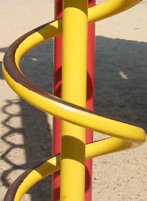
| Nice lines and shadows, but too recognizable to be considered truely abstract. |
|
|
|
05/04/2004 02:19:12 PM |
| I think this would have been more effective if you had cut out the background altogether, and just had the pole and helix. |
|
|
|
05/04/2004 07:54:26 AM |
| Looks like the pole is tilted clockwise slightly. I also find the shadows are a bit distracting to me. This might have done well in b/w as it would hide the playground equipment feeling. |
|
|
|
05/03/2004 04:29:53 PM |
| It's got some nice qualities. The contrast is a bit blah for my tastes and in this case I think the shadow is a distracting element. It doesn't unify the design of curcving lines and verticals. It's just kind of 'there'. |
|
|
|
05/03/2004 04:26:32 AM |
| This is my favourite of all. If I could vote I'd give you a 10. |
|
|
|
05/03/2004 12:28:17 AM |
| The title tells me what this is, so now it's not abstract anymore. |
|
Home -
Challenges -
Community -
League -
Photos -
Cameras -
Lenses -
Learn -
Help -
Terms of Use -
Privacy -
Top ^
DPChallenge, and website content and design, Copyright © 2001-2025 Challenging Technologies, LLC.
All digital photo copyrights belong to the photographers and may not be used without permission.
Current Server Time: 03/15/2025 02:59:27 AM EDT.