| Author | Thread |
|
|
11/27/2008 01:01:20 PM |
Hello from critique club :)
Hey what'ya know, I get to critique your photo :D cool.
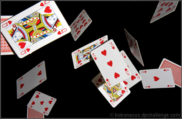
To start with this is not a 5.3 picture, worth more than that. So why didn't DPC give you better vote?
Composition is very nice. I like the spreading of the cards randomly, further cards out of focus which is also nice. Shadows and reflections are right on the money here. It truly matches the challenge, and it's quite of work to do this, some people just don't understand the work behind some of the photos.
Technically very good photo, I like it a lot. There are only few minor things that couth my eyes, but should not be the reason to give you 3 or 4 or 5s.
The edges of some of the cards you can see something was there and taken out with Photoshop. Just a point or two and right top corner card has more edge problem.
If I did vote, I would give 7 or minimum 6 to this photo.
Keep up the good work, nothing is wrong with you a lots of things wrong with DOC voters sometime, don't let it get under your skin.
Leo |
|
 Photographer found comment helpful. Photographer found comment helpful. |
Comments Made During the Challenge  |
|
|
11/23/2008 09:05:48 AM |
| Very bold - stands out well against the black background. Would have been even better if there had been thirteen cards used not fourteen! =) |
|
| Photographer found comment helpful. |
|
|
11/22/2008 04:12:16 PM |
| Very nice, are they suspended from string? Good lighting. |
|
| Photographer found comment helpful. |
|
|
11/22/2008 12:00:48 PM |
|
| Photographer found comment helpful. |
|
|
11/21/2008 10:19:51 AM |
| Lots of hearts! Were these thrown and quickly shot or somehow placed in those positions? Either way looks sort of difficult. The lighting is a bit harsh and there are 14 cards. |
|
| Photographer found comment helpful. |
|
|
11/18/2008 02:09:23 PM |
| nicely frozen. nothing blown out...well done |
|
| Photographer found comment helpful. |
|
|
11/17/2008 07:03:18 PM |
| Interesting, and I am sure a lot of work, good depth of field, good color, good contrast, I am not sure but maybe closing some of the black space and lessening the cluster in the middle might help (but it might not either) |
|
| Photographer found comment helpful. |
|
|
11/17/2008 06:58:01 PM |
Very clever shot. I look forward to Photographer's comments about how this was made.
Given the rim of the 9 & 10 of hearts - is the lighting too harsh?
Wonderful effort! |
|
| Photographer found comment helpful. |
|
|
11/17/2008 08:48:11 AM |
| Fun card shot, I love the feeling of motion here and the composition. Don't care for the flash shadows on a few of the cards, but I see how that might not have been avoidable. Subject is ordinary. |
|
| Photographer found comment helpful. |
|
|
11/17/2008 01:17:42 AM |
| Nice capture of the falling cards |
|
| Photographer found comment helpful. |
|
|
11/17/2008 01:00:19 AM |
| Great capture and the only deck of cards in the whole bunch of entries (that I've seen so far) |
|
| Photographer found comment helpful. |
Home -
Challenges -
Community -
League -
Photos -
Cameras -
Lenses -
Learn -
Help -
Terms of Use -
Privacy -
Top ^
DPChallenge, and website content and design, Copyright © 2001-2025 Challenging Technologies, LLC.
All digital photo copyrights belong to the photographers and may not be used without permission.
Current Server Time: 03/11/2025 01:53:16 PM EDT.