| Author | Thread |
Comments Made During the Challenge  |
|
|
05/11/2004 11:04:14 PM |
| while it is rusted, it is not particularily interesting. I think that the lighting is ok, and the angle at which you chose to shoot your subject is ok, but it's just not drawing me in and holding me there. I think it's pretty plain. While technically well done, just not exciting. ~Heather~ |
|
 Photographer found comment helpful. Photographer found comment helpful. |
|
|
05/11/2004 11:44:18 AM |
| Interesting lines and composition, but feels washed out somewhat. Maybe more saturation or different lighting would help. |
|
| Photographer found comment helpful. |
|
|
05/11/2004 09:36:38 AM |
|
| Photographer found comment helpful. |
|
|
05/10/2004 11:26:15 AM |
Composition: Subject Placement, Cropping, Background 5
Technical: Focus, Exposure, Lighting, Processing 7
Appeal: Is it Interesting, Motivating, Etc.? 3
How well does it meet the challenge: 9
Total Averaged Rating 6.00 Dick
|
|
| Photographer found comment helpful. |
|
|
05/09/2004 10:04:30 PM |
Composition: Subject Placement, Cropping, Background 5
Technical: Focus, Exposure, Lighting, Processing 6
Appeal: Is it Interesting, Motivating, Etc. 4
How well does it meet the challenge: 7
Total Averaged Rating(Rounded) 6
|
|
| Photographer found comment helpful. |
|
|
05/09/2004 12:26:43 AM |
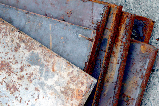
| The composition works quite well on an abstract level. I like it. The most saturated colors are in the right place. |
|
| Photographer found comment helpful. |
|
|
05/07/2004 09:57:47 AM |
| nice shot but not something I would hang on my wall |
|
| Photographer found comment helpful. |
|
|
05/07/2004 04:56:19 AM |
| I think the composition could use a little work, it doesnt really provide enough interest for me |
|
| Photographer found comment helpful. |
|
|
05/06/2004 09:54:58 PM |
| Colors are attractive but don't know why you chose this framing. |
|
| Photographer found comment helpful. |
|
|
05/06/2004 08:35:50 PM |
|
| Photographer found comment helpful. |
|
|
05/06/2004 03:55:24 PM |
|
| Photographer found comment helpful. |
|
|
05/05/2004 06:34:08 PM |
| Like the composition of this subject. Brights are distractingly blown out though--tighter crop could have eliminated much of that. |
|
| Photographer found comment helpful. |
|
|
05/05/2004 12:56:22 PM |
| the title is a bit obtuse, but great composition. |
|
| Photographer found comment helpful. |
|
|
05/05/2004 01:40:56 AM |
| The colors are nice on the bottom pieces - but it's too bad that bright one is on top. |
|
| Photographer found comment helpful. |
Home -
Challenges -
Community -
League -
Photos -
Cameras -
Lenses -
Learn -
Help -
Terms of Use -
Privacy -
Top ^
DPChallenge, and website content and design, Copyright © 2001-2025 Challenging Technologies, LLC.
All digital photo copyrights belong to the photographers and may not be used without permission.
Current Server Time: 03/12/2025 02:51:42 PM EDT.