| Author | Thread |
|
|
12/01/2008 12:59:51 AM |
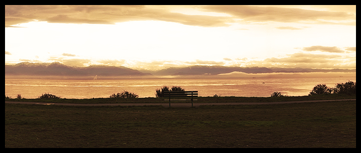
| I didn't think a 3 image stitch panorama was legal, but I suppose it's the same scene taken as if it was a wider lens. |
|
Comments Made During the Challenge  |
|
|
11/30/2008 06:54:52 PM |
| The bench blends in with the vegetation imo. Re-composing from your left would have shown it better against the water. |
|
|
|
11/28/2008 08:56:33 PM |
| I like almost every thing about your photo. But the bench gets lost in the bush. If you had moved to your left a few feet, it would have been totally silhoutted against the sky and I might have liked it better. |
|
|
|
11/28/2008 07:27:19 PM |
| Looks like a beautiful scene. This might be a good candidate for an HDR image. The blown out sky and underexposed land just take up too much space in this shot. |
|
|
|
11/28/2008 01:34:50 PM |
| Lovely shot, would be nicer if there wasnt a bush behind the bench so you couls see all the way through the slats. still a good one though! |
|
|
|
11/28/2008 11:34:03 AM |
| I like the semi-panoramic approach to show the vastness. I kinda wish you might have moved a couple steps to the left to have the bench more open to the water (ie not have it's view blocked by the vegetation.) |
|
|
|
11/26/2008 11:50:55 AM |
|
|
|
11/26/2008 11:48:51 AM |
| I would have been nicer if changed angles to avoid the tree/bush behind the bench. |
|
|
|
11/25/2008 07:00:21 PM |
Is that a giraffe on the horizon, center left? :)
nice sentiment |
|
|
|
11/24/2008 09:26:37 PM |
| I like this picture but think if you had moved to the left another foot or twothe bench would have been more visible... Other than that, looks like a place I'd love to sit for a spell. |
|
|
|
11/24/2008 06:23:41 PM |
| the bench gets lost in the background |
|
|
|
11/24/2008 05:19:06 PM |
| I wish the bench would have been more visible - brush takes away form the bench - otherwise great picture |
|
|
|
11/24/2008 10:06:26 AM |
| Nice photo. I would have liked it a bit more, if you could have gotten the bench at an angle where the trees (shrubs?) in the distance hadn't blended in with the bench. Normally I am not a fan of blown out highlights, but it really works here. Gives your image a painterly effect. |
|
|
|
11/24/2008 01:43:58 AM |
| I don't understand why you wouldn't change your position a bit to the left so this bench was fully defined. For me t's a crippling defect in an otherwise truly promising image... |
|
Home -
Challenges -
Community -
League -
Photos -
Cameras -
Lenses -
Learn -
Help -
Terms of Use -
Privacy -
Top ^
DPChallenge, and website content and design, Copyright © 2001-2025 Challenging Technologies, LLC.
All digital photo copyrights belong to the photographers and may not be used without permission.
Current Server Time: 04/27/2025 05:11:56 AM EDT.