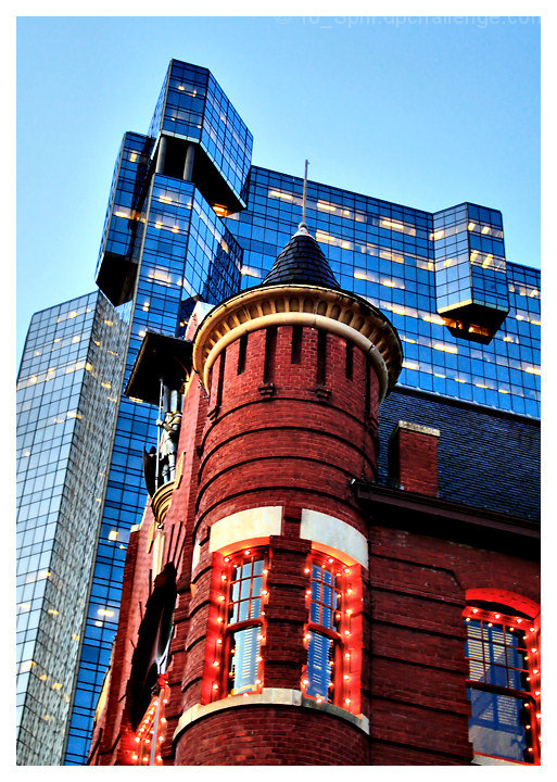
Downtown Fort Worth at dusk. I think it's pretty darn good for handheld at 1/15. A tripod would have certainly helped. This was a short walkaround after shooting my entry for "mirrors", and I was not shooting with a challenge entry in mind at this time. This shot stood out to me, however.
Pre-challenge notes:
Except for a little more noise than I would prefer in the blue glass tower, I'm pretty darn happy with this. Hoping for a high 5 out of it, though a 6 in a freestudy would be awesome. (Not counting on that!)
Post-challenge notes:
Well, the score and the critiques tell me that this was not the great entry I thought it was. Some special appreciation for SmudgeSMJ who left me some exceptional feedback when I asked her for an explanation of her comment.
Statistics
Place: 331 out of 417 Avg (all users): 5.1565 Avg (commenters): 5.3333 Avg (participants): 5.0722 Avg (non-participants): 5.3200 Views since voting: 933 Views during voting: 236 Votes: 147 Comments: 7 Favorites: 0
Tilt doesn't add much for this shot. Also, it's a weird juxtaposition between twilight and seemingly broad daylight - timing the sky a bit later might have worked better.
Interesting idea, but I don't feel that this pic could possibly be the one that either 1. expresses you the best or 2. expresses your talent the best for the entire month.
ETA: Okay, here's me trying to figure out what it is that I think could be improved about your submission. I think this might get long because I type while I think, so bear with me. I'm going to use examples of buildings that I think are particularly well done and contrast them with yours to figure out what's lacking to me, if that's alright. Here we go:
Here's one that really resonates with me. I feel that because of the more open composition and the reflection, it's more visually satisfying. There's more depth to it, and nothing feels like it's getting blocked. I feel that yours, in contrast, might lose some of its feeling of depth because the building in front is blocking the building in back.
Here's one that also appeals to me. Maybe I'm just a sucker for reflections? :) Here, we can see two buildings, much like in your picture, but because of the broken mirror I find it more visually engaging. Your entry feels like walking down the street and taking a picture from eye level. It doesn't have any tricks up its sleeve, no new angles or perspectives or pizazz to separate it from what a person would normally see. I gather that you were trying to emphasize the juxtaposition of old and new, but I think your title is what seals that for me rather than the composition of the picture.
Something like this (more reflections, gee I am a softy for them I guess!) with the old building reflected in the shiny new windows of the skyscraper I think would have conveyed a relationship between the buildings better. A wide gap of sky to demonstrate that they're separated by time, but the reflection shows that they're connected by proximity. Oops, I just let out my film degree critic who finds meaning in everything, I try not to do that too often :)
All of this is not to say that I find it a completely unappealing picture, I just think that you, and especially now that I know who's entry this is, have a way to make it different than what Joe Shmoe would see while walking down the street. Some sort of visual gimmick that visually expresses the relationship between these two awesome buildings.