| Author | Thread |
|
|
05/12/2004 02:18:51 AM |
* Greetings from the Critique Club *
cybele,
First - Congratulations on being in the top 10% on only your 3rd challenge! There are many, many members who have only dreamed of a finish that high.
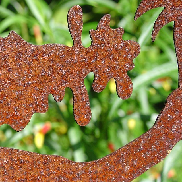
Your image is one I commented on during the voting, with "Your image, intentional or not, is an optical illusion. Sometimes it looks like the rusty area is the object and other times like the green area is the object. Nice rust and texture therin. If you rotate it 90 degrees counter clockwise it may be a stronger image - kinda like a human figure. If you re-shoot try to tone down the background a bit by making those bright yellow / orange objects fall into a shadowed area."
I stand by my earlier comments - and note that most of the commenters have positive comments about your entry. So, having said all that - it's time to take a great submission into a ribbon winner. How can we do that?
a) Most of the suggestions for improvement revolved around composition. Studying the image objectively - as if it were someone else's image - you may note that: 1) There is a stranded triangle at the bottom right corner, which means the image doesn't have much of a "base" to work from.
b) Maybe more importantly, a few felt like the image would be stronger if the left edge became the bottom.
But - hey - don't lose the fact that this image was rated better than nearly 400 other submissions. Now it's not a matte of starting over - but instead - just "tweaking" what you've already done.
Keep up the great work.
|
|
 Photographer found comment helpful. Photographer found comment helpful. |
Comments Made During the Challenge  |
|
|
05/11/2004 12:51:38 PM |
| I love the way this is almost a silhoutette with texture. Great depth of field and excellent lighting. |
|
| Photographer found comment helpful. |
|
|
05/10/2004 06:56:28 PM |
I like this one a lot. Very sharp and very abstract.
Good job with the depth of field. too. |
|
| Photographer found comment helpful. |
|
|
05/10/2004 12:56:32 PM |
Composition: Subject Placement, Cropping, Background 6
Technical: Focus, Exposure, Lighting, Processing 6
Appeal: Is it Interesting, Motivating, Etc.? 5
How well does it meet the challenge: 10
Total Averaged Rating 6.75 Dick
|
|
| Photographer found comment helpful. |
|
|
05/09/2004 03:21:08 PM |
Interesting although composition does not work for me. Great choice on lighting and depth of field.
A 7. |
|
| Photographer found comment helpful. |
|
|
05/08/2004 09:33:52 PM |
Composition: Subject Placement, Cropping, Background 5
Technical: Focus, Exposure, Lighting, Processing 6
Appeal: Is it Interesting, Motivating, Etc. 4
How well does it meet the challenge: 7
Total Averaged Rating(Rounded) 6
|
|
| Photographer found comment helpful. |
|
|
05/08/2004 05:32:09 PM |
| Very nice. Great macro detail and sharp focus. |
|
| Photographer found comment helpful. |
|
|
05/08/2004 10:32:37 AM |
| dof is awesome. this almost looks 3d. great shot !!! |
|
| Photographer found comment helpful. |
|
|
05/07/2004 12:04:30 PM |
Composition: Subject Placement, Cropping, etc. 6
Technical: Focus, Exposure, Lighting, Processing 6
Appeal: Is it Interesting, Motivating, Etc.? 7
Does this picture meet the challenge?(5pts) Yes
Total Challenge Weighted Average 6 Bill
|
|
| Photographer found comment helpful. |
|
|
05/07/2004 10:34:14 AM |
| lol if you rotate it 90 degrees counter clockwise it looks like maggie simpson (from the simpsons) under a palm tree. well done.<9> |
|
| Photographer found comment helpful. |
|
|
05/07/2004 07:29:52 AM |
| Nice photo. Congratulations! I give you a 9. |
|
| Photographer found comment helpful. |
|
|
05/06/2004 06:21:40 PM |
| Your image, intentional or not, is an optical illusion. Sometimes it looks like the ruty area is the object and other times like the green area is the object. Nice rust and texture therin. If you rotate it 90 degrees counter clockwise it may be a stronger image - kinda like a human figure. If you re-shoot try to tone down the background a bit by making those bright yellow / orange objects fall into a shadowed area. |
|
| Photographer found comment helpful. |
|
|
05/06/2004 05:47:41 PM |
| Interesting abstract - looks a bit oversharpened or over-contrasted. I think I would find this more appealing a bit more zoomed out in order to see what the sculpture was. |
|
| Photographer found comment helpful. |
|
|
05/06/2004 10:34:40 AM |
| The green background contrasts well with the subject and makes for an interesting abstract |
|
| Photographer found comment helpful. |
|
|
05/06/2004 04:57:30 AM |
| i love this piece. Fantastic contrast between the front and the background in terms of both colours and details. |
|
| Photographer found comment helpful. |
|
|
05/05/2004 03:52:56 PM |
| Interesting use of negative space. Nice strong detail in the subject. |
|
| Photographer found comment helpful. |
|
|
05/05/2004 02:04:23 AM |
|
| Photographer found comment helpful. |
Home -
Challenges -
Community -
League -
Photos -
Cameras -
Lenses -
Learn -
Help -
Terms of Use -
Privacy -
Top ^
DPChallenge, and website content and design, Copyright © 2001-2025 Challenging Technologies, LLC.
All digital photo copyrights belong to the photographers and may not be used without permission.
Current Server Time: 03/12/2025 03:24:51 PM EDT.