| Author | Thread |
Comments Made During the Challenge  |
|
|
05/18/2004 11:24:05 PM |
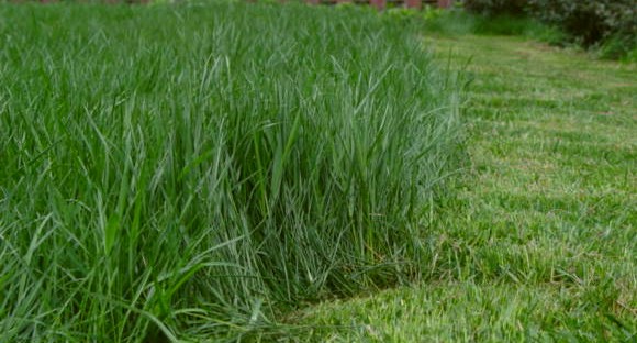
| Great color and textures - the difference between the two is really fun - I like that it's not a regular line between the two. The contrast could be bumped a little and perhaps a little closer framing to create a stronger composition. |
|
 Photographer found comment helpful. Photographer found comment helpful. |
|
|
05/18/2004 12:14:15 AM |
| I don't see anything in focus. |
|
| Photographer found comment helpful. |
|
|
05/16/2004 07:36:06 AM |
| Need to work on focus and contrast. Really cool idea for a picture though! |
|
| Photographer found comment helpful. |
|
|
05/15/2004 02:52:03 PM |
| Okay idea - but I think you've got uncut grass vs. cut grass. Tonal contrast between the two is weak and the framing is off. Whatever the "red" things are in the background - they serve to distract the reader - especially because red and green are opposite hues. |
|
| Photographer found comment helpful. |
|
|
05/13/2004 07:23:29 PM |
| difference does not entail opposition? |
|
| Photographer found comment helpful. |
|
|
05/12/2004 04:00:32 PM |
| good idea but I think maybe a lower angle to get more of the background or a tighter crop to remove the fence woulda been better |
|
| Photographer found comment helpful. |
|
|
05/12/2004 09:32:11 AM |
| I like the idea, I just can't see it as well as I would like. A common back ground with contrast would help. |
|
| Photographer found comment helpful. |
Home -
Challenges -
Community -
League -
Photos -
Cameras -
Lenses -
Learn -
Help -
Terms of Use -
Privacy -
Top ^
DPChallenge, and website content and design, Copyright © 2001-2025 Challenging Technologies, LLC.
All digital photo copyrights belong to the photographers and may not be used without permission.
Current Server Time: 04/27/2025 05:25:26 AM EDT.