| Author | Thread |
Comments Made During the Challenge  |
|
|
05/18/2004 11:13:41 PM |
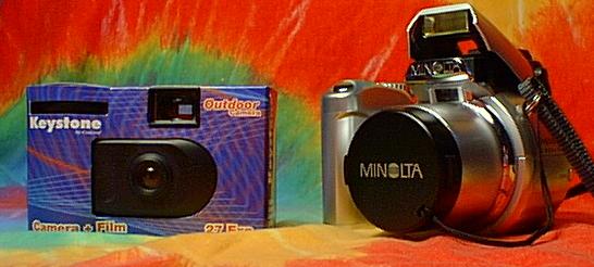
| I find the background too loud. |
|
|
|
05/18/2004 05:44:54 AM |
|
|
|
05/17/2004 11:17:21 PM |
| The background is exceedingly distracting, and the picture is grainy. |
|
|
|
05/17/2004 09:43:39 AM |
| Sharper focus on the cheap one is the only thing this shot lacks. You could even have called this professional/amateur. |
|
|
|
05/15/2004 09:00:12 PM |
| For me, the background is a little bit distracting here. |
|
|
|
05/15/2004 07:16:22 AM |
| Out of fucus or to much sharpen. |
|
|
|
05/14/2004 05:17:51 PM |
| good idea. the title would be better if the 2 zeros werent there. then its really just going from 3.99 to 399. nice shot anyway -7 |
|
|
|
05/14/2004 03:47:11 PM |
| Where is the focal point of this picture? |
|
|
|
05/14/2004 10:20:21 AM |
| Seems out of focus, and the background is competing strongly with the subjects instead of complimenting them. Shadows on the minolta are also distracting. |
|
|
|
05/14/2004 03:49:37 AM |
Nice idea.
Looks like it was taken with disposable one |
|
|
|
05/13/2004 11:44:15 PM |
| good contrast for cheap and expensive, but the background is a bit tacky |
|
|
|
05/13/2004 03:58:43 PM |
| Yes...and it looks like it was taken with the $3.99 one! |
|
|
|
05/13/2004 08:00:13 AM |
| This is not so sharp as I expect. May be by resizing colateral. |
|
|
|
05/13/2004 07:54:48 AM |
| Seems a litle grainy or pixaleted. Also I think the setup isn´t very good and the background is to agressive and takes the attention from the main subjects. |
|
|
|
05/13/2004 01:14:44 AM |
| It appears that there is a lot of digital 'noise' in the picture. Maybe some post procesing sharpening after the cropping and resizing would have helped. |
|
|
|
05/12/2004 08:58:35 PM |
| I think you deserve to win this challenge. This is my first challenge, but you that was an exallent idea, and very original. Perfect background to. |
|
|
|
05/12/2004 06:31:49 PM |
| Nice colors and very original, a beter crop on the right hand side would have been good, but overall pretty cool photo. I give you an 8. |
|
|
|
05/12/2004 02:46:10 PM |
| Nice unique idea. although I think the photo could have been a bit sharper I really am impressed with the uniquness of this photo, well at least the titile. |
|
|
|
05/12/2004 11:03:48 AM |
... and how much did you pay for the camera that took this picture ??? ... :)
|
|
|
|
05/12/2004 06:30:16 AM |
| Nice job... I like the comparison! |
|
|
|
05/12/2004 03:43:50 AM |
| i reeeeally dont like the tie dye background |
|
|
|
05/12/2004 03:14:20 AM |
| poor image quality - compressed way too much. the bright background has to go |
|
|
|
05/12/2004 02:02:12 AM |
|
Home -
Challenges -
Community -
League -
Photos -
Cameras -
Lenses -
Learn -
Help -
Terms of Use -
Privacy -
Top ^
DPChallenge, and website content and design, Copyright © 2001-2025 Challenging Technologies, LLC.
All digital photo copyrights belong to the photographers and may not be used without permission.
Current Server Time: 03/12/2025 02:37:28 AM EDT.