| Author | Thread |
Comments Made During the Challenge  |
|
|
05/17/2004 04:09:33 AM |
| Thats a pretty cool sign, nice shot too. Good job overall... |
|
 Photographer found comment helpful. Photographer found comment helpful. |
|
|
05/17/2004 12:45:33 AM |
| What a great capture. It fits the challenge will. I love the blues and the texture of the post. |
|
| Photographer found comment helpful. |
|
|
05/15/2004 04:20:15 PM |
| Nice tone on the post. There seems to be an excessive amount of jpeg artifacts along the edge of the signs. |
|
| Photographer found comment helpful. |
|
|
05/15/2004 10:43:25 AM |
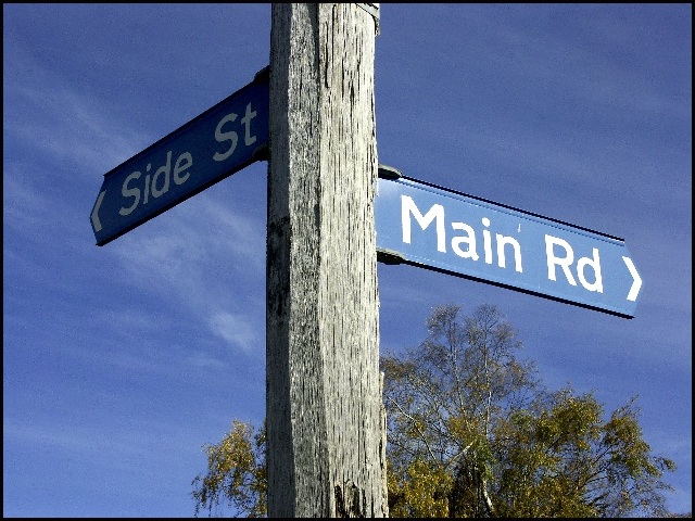
| Good colors - nice lighting and a perfect sign showing opposites. I was going to say you needed more light on "side street" but finally concluded that is was a nice irony that the side street is shadowed. Composition seems a bit centered - and just wonder what would it look like if it was shot with the sign pole being a little diagonal instead of straight vertical. |
|
| Photographer found comment helpful. |
|
|
05/15/2004 01:07:54 AM |
| cute image. nice title. :-) |
|
| Photographer found comment helpful. |
|
|
05/14/2004 12:39:59 PM |
|
| Photographer found comment helpful. |
|
|
05/13/2004 10:38:34 AM |
I'm not sure if they are opposites?
But a nice idea.
The "side St." seems a bit dark. |
|
| Photographer found comment helpful. |
|
|
05/13/2004 01:51:58 AM |
| I love the signs, Where is this? exposure looks good, but may have used too much of the sharpen tool. 6 |
|
| Photographer found comment helpful. |
|
|
05/12/2004 09:45:46 PM |
| Very funny and a nice idea for this challenge! I like that the light falls brightly on the "Main Rd" sign and dimly on the "Side St." The angle is interesting--just showing tree and sky in the background really focuses attention on the subject. There is a little pixelation on the signs and the tree -- probably just an artifact of compression to meet the challenge requirements. Overall, very nice. |
|
| Photographer found comment helpful. |
|
|
05/12/2004 08:07:51 PM |
| This is classic. The focus seems a little off, but that may just be your camera's digitization. |
|
| Photographer found comment helpful. |
|
|
05/12/2004 06:47:05 PM |
| great capture. love how the main road is bright, and the side streat is in the shadows... |
|
| Photographer found comment helpful. |
|
|
05/12/2004 01:37:38 PM |
|
| Photographer found comment helpful. |
|
|
05/12/2004 12:59:45 PM |
Technical: Focus, Exposure, Lighting, 9
Appeal: does it caught your attention, Motivating, Etc.? 9
How well does it meet the challenge: 10
Total Averaged Rating
|
|
| Photographer found comment helpful. |
|
|
05/12/2004 03:46:08 AM |
| I'm from a small town, so i definitely appreciate this pic!! only problem is, it kinda hurts my eyes to look at because its oversharpened. |
|
| Photographer found comment helpful. |
|
|
05/12/2004 03:43:42 AM |
| I like this picture a lot, and it fits the challenge very well. But it is severely oversharpened. I'd want to give this an 8 or 9, but the oversharpening drops it a few points. |
|
| Photographer found comment helpful. |
Home -
Challenges -
Community -
League -
Photos -
Cameras -
Lenses -
Learn -
Help -
Terms of Use -
Privacy -
Top ^
DPChallenge, and website content and design, Copyright © 2001-2025 Challenging Technologies, LLC.
All digital photo copyrights belong to the photographers and may not be used without permission.
Current Server Time: 03/12/2025 08:55:48 AM EDT.