| Author | Thread |
|
|
01/31/2009 01:02:54 AM |
Steve
Your style is quite different to the DPC norm but it's great in its own way. Make sure you keep doing what you like and avoid the temptation to chase votes. |
|
Comments Made During the Challenge  |
|
|
01/27/2009 11:01:11 PM |
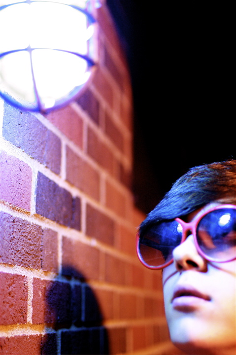
Just surreal enough to be irrational. Just irrational enough to be surreal. I like the circular array of objects: the dark void; the brick wall; the shadow; the light (both compelling and dangerous, as befits a worthy attraction); and of course the mildly android-looking protagonist with the magical lipstick glasses. Everything means something here, there's not a wasted photon, and everything's connected to everything else. It's like a game of scissors-paper-stone in which each element of the photograph is 'stronger' than something and 'weaker' than something else. And happily, there is no solution; it's irrational.
The most interesting photograph in the challenge. I therefore give it a 10, plus the Order of the Thumb.
 |
|
 Photographer found comment helpful. Photographer found comment helpful. |
|
|
01/27/2009 09:10:50 PM |
| The focus should be the boy i feel, and npt the bricks in this photo |
|
|
|
01/27/2009 07:20:58 PM |
| The focus is off in this photo. It's on the hair and wall, instead of the glasses. |
|
|
|
01/26/2009 12:59:50 PM |
| Very well balanced and an interesting shot. neither the guy nor the lamp is in focus but it doesn't matter. I like it the way it is and it gives it an 'artsy' look. Upgraded from a 5 to a 7 on second pass. |
|
|
|
01/26/2009 01:45:32 AM |
I like the abstract natute of this. It's quite like an 80s album cover.
Unfortunately I think the focus needs to be on the glasses to really make them stand out. |
|
|
|
01/24/2009 05:16:42 PM |
|
|
|
01/23/2009 05:47:05 PM |
| Not really loving the out of focus on the main subject as it makes the wall look like it's the main focus but, I see where you were going with this shot and it's a difficult shot to get |
|
|
|
01/22/2009 01:57:14 PM |
| The odd composition of this shot would work for me except for the focus being on the bricks instead of the person. |
|
| Photographer found comment helpful. |
|
|
01/21/2009 12:25:44 AM |
| nice. love the dof. nice texture on the brick. |
|
Home -
Challenges -
Community -
League -
Photos -
Cameras -
Lenses -
Learn -
Help -
Terms of Use -
Privacy -
Top ^
DPChallenge, and website content and design, Copyright © 2001-2025 Challenging Technologies, LLC.
All digital photo copyrights belong to the photographers and may not be used without permission.
Current Server Time: 03/10/2025 08:58:07 PM EDT.