| Author | Thread |
Comments Made During the Challenge  |
|
|
05/18/2004 09:11:51 AM |
| Something about the texture of this photo draws me to it. Nice pastel look. |
|
 Photographer found comment helpful. Photographer found comment helpful. |
|
|
05/17/2004 07:41:21 PM |
| Nice composition and colors. Some areas look a little grainy. |
|
| Photographer found comment helpful. |
|
|
05/17/2004 03:00:30 PM |
| Nice shot. I don�t think the graininess works too well though |
|
| Photographer found comment helpful. |
|
|
05/17/2004 01:17:23 PM |
| thats my favorite color!!! |
|
| Photographer found comment helpful. |
|
|
05/15/2004 02:36:30 PM |
|
|
|
05/15/2004 10:37:39 AM |
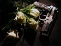
| Very nice! Texture and soft colors on the top flower are very nice. The repeated shape of the out-of-focus flower adds a nice compositional element. I was wondering about the lighting on te back flower but finally concluded it helps separate the colors of the petals front to back. Fills the frame very nicely. |
|
| Photographer found comment helpful. |
|
|
05/14/2004 03:52:53 PM |
|
| Photographer found comment helpful. |
|
|
05/14/2004 12:41:06 PM |
| Wow! This is the first use of focus as an opposite which looked to me like it worked rather than just being accidental. The colors are beutiful, the focus is excellent, and the depth of field works for me. One of my favorites so far! |
|
| Photographer found comment helpful. |
|
|
05/14/2004 11:12:11 AM |
| I would have preferred to have some light on the flower in the foreground. |
|
| Photographer found comment helpful. |
|
|
05/13/2004 04:08:35 PM |
| cool picture. But where is the opposite ? Focus and unfocus. |
|
| Photographer found comment helpful. |
|
|
05/13/2004 02:44:22 PM |
Nice concept of opposites.
The only thing I would look to change would be to possibly increase the lighting to help bring out the colors of the in-focus flower more. |
|
| Photographer found comment helpful. |
|
|
05/13/2004 04:31:56 AM |
| Very nice, I'll vote it in my top 20 favorites. Good job! |
|
| Photographer found comment helpful. |
|
|
05/12/2004 10:17:03 PM |
| An o.k. idea for this challenge: in focus/out of focus, in front of/behind, shadowed/lit... The graininess, intentional or not, adds a painterly feel to the photo. The cropping is lovely, showing just enough of each flower--there is strong patterning there and yet it doesn't feel cut off. Overall, a picture to be proud of! |
|
| Photographer found comment helpful. |
|
|
05/12/2004 05:35:05 PM |
|
| Photographer found comment helpful. |
|
|
05/12/2004 10:37:10 AM |
| I really like this picture, especially the grain and composition... A bit of a stretch for "opposites"... but a good picture never the less. |
|
| Photographer found comment helpful. |
|
|
05/12/2004 09:33:46 AM |
| Did the editing remove the "realness" of the flower? Good interpretation. |
|
| Photographer found comment helpful. |
Home -
Challenges -
Community -
League -
Photos -
Cameras -
Lenses -
Learn -
Help -
Terms of Use -
Privacy -
Top ^
DPChallenge, and website content and design, Copyright © 2001-2025 Challenging Technologies, LLC.
All digital photo copyrights belong to the photographers and may not be used without permission.
Current Server Time: 03/12/2025 05:04:10 PM EDT.